gerrymander |>
  mutate(flip18 = as_factor(flip18)) |>
  ggplot(aes(x = gerry, fill = flip18)) +
  geom_bar(position = "fill")
Lecture 6
We had to mutate before plotting. Two methods:
Do it all at once and don’t store intermediately:
gerrymander |>
mutate(flip18 = as_factor(flip18)) |>
ggplot(aes(x = gerry, fill = flip18)) +
geom_bar(position = "fill")
Mutate, store change; then, plot
gerrymander <- gerrymander |>
  mutate(flip18 = as_factor(flip18))

ggplot(gerrymander, aes(x = gerry, fill = flip18)) +
  geom_bar(position = "fill")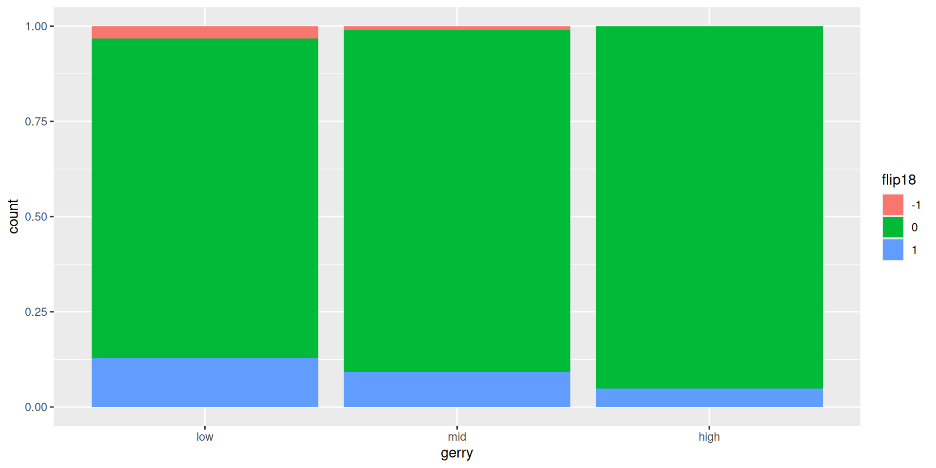
Why is this a travesty?
gerrymander <- gerrymander |>
  mutate(flip18 = as_factor(flip18)) |>
  ggplot(aes(x = gerry, fill = flip18)) +
geom_bar(position = "fill")gerrymander is no longer a data frame. It’s a plot…thing:
gerrymander |>
  filter(state == "TX")
Error in `UseMethod()`:
! no applicable method for 'filter' applied to an object of class "c('ggplot2::ggplot', 'ggplot', 'ggplot2::gg', 'S7_object', 'gg')". . .
You can overwrite an object if its identity is preserved; if the rows or columns now mean something totally different, or if it’s an entirely different class of object, then give it a new name.
“Tidy datasets are easy to manipulate, model and visualize, and have a specific structure: each variable is a column, each observation is a row, and each type of observational unit is a table.”
Tidy Data, https://vita.had.co.nz/papers/tidy-data.pdf
. . .
Note: “easy to manipulate” = “straightforward to manipulate”
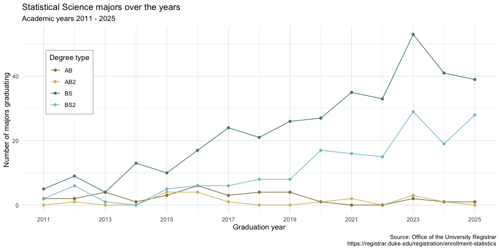
Visualize Duke StatSci majors over the years!
statsci# A tibble: 4 × 16
degree_type `2011` `2012` `2013` `2014` `2015` `2016` `2017` `2018`
<chr> <dbl> <dbl> <dbl> <dbl> <dbl> <dbl> <dbl> <dbl>
1 AB2 0 1 0 0 4 4 1 0
2 AB 2 2 4 1 3 6 3 4
3 BS2 2 6 1 0 5 6 6 8
4 BS 5 9 4 13 10 17 24 21
# ℹ 7 more variables: `2019` <dbl>, `2020` <dbl>, `2021` <dbl>,
# `2022` <dbl>, `2023` <dbl>, `2024` <dbl>, `2025` <dbl>The first column (variable) is the degree:
The remaining columns show the number of students graduating with that major in a given academic year from 2011 to 2025.
Review the goal plot and sketch the data frame needed to create it. What would go inside aes when we call ggplot?
We want to write code that starts something like this:
ggplot(statsci, aes(x = year, y = n, color = degree_type)) +
  ...
. . .
But our data are not in the right format as is:(
statsci# A tibble: 4 × 16
degree_type `2011` `2012` `2013` `2014` `2015` `2016` `2017` `2018`
<chr> <dbl> <dbl> <dbl> <dbl> <dbl> <dbl> <dbl> <dbl>
1 AB2 0 1 0 0 4 4 1 0
2 AB 2 2 4 1 3 6 3 4
3 BS2 2 6 1 0 5 6 6 8
4 BS 5 9 4 13 10 17 24 21
# ℹ 7 more variables: `2019` <dbl>, `2020` <dbl>, `2021` <dbl>,
# `2022` <dbl>, `2023` <dbl>, `2024` <dbl>, `2025` <dbl>How do we go from this ….
# A tibble: 4 x 16 degree_type 2011 2012 2013 2014 2015 2016 2017 2018 2019
1 AB2 0 1 0 0 4 4 1 0 0
2 AB 2 2 4 1 3 6 3 4 4
3 BS2 2 6 1 0 5 6 6 8 8
4 BS 5 9 4 13 10 17 24 21 26…. to this??
# A tibble: 60 x 3 degree_type year n
1 AB2 2011 0
2 AB2 2012 1
3 AB2 2013 0
4 AB2 2014 0
5 AB2 2015 4
6 AB2 2016 4
7 AB2 2017 1
8 AB2 2018 0
9 AB2 2019 0
10 AB2 2020 1
11 AB2 2021 2
12 AB2 2022 0
13 AB2 2023 3
14 AB2 2024 1
15 AB2 2025 0
16 AB 2011 2
17 AB 2012 2pivot_longer()# A tibble: 4 x 16 degree_type 2011 2012 2013 2014 2015 2016 2017 2018 2019
1 AB2 0 1 0 0 4 4 1 0 0
2 AB 2 2 4 1 3 6 3 4 4
3 BS2 2 6 1 0 5 6 6 8 8
4 BS 5 9 4 13 10 17 24 21 26Pivot the statsci data frame longer such that each row represents a degree type / year combination.
year and number of graduates for that year are columns in the result data frame.
⟶
# A tibble: 60 x 3 degree_type year n
1 AB2 2011 0
2 AB2 2012 1
3 AB2 2013 0
4 AB2 2014 0
5 AB2 2015 4
6 AB2 2016 4
7 AB2 2017 1
8 AB2 2018 0
9 AB2 2019 0
10 AB2 2020 1
11 AB2 2021 2
12 AB2 2022 0
13 AB2 2023 3
14 AB2 2024 1
15 AB2 2025 0
16 AB 2011 2
17 AB 2012 2pivot_longer()# A tibble: 4 x 16 degree_type 2011 2012 2013 2014 2015 2016 2017 2018 2019
1 AB2 0 1 0 0 4 4 1 0 0
2 AB 2 2 4 1 3 6 3 4 4
3 BS2 2 6 1 0 5 6 6 8 8
4 BS 5 9 4 13 10 17 24 21 26statsci |>
pivot_longer(
cols = ___________________ ,
names_to = _______________ ,
values_to = ______________
)⟶
# A tibble: 60 x 3 degree_type year n
1 AB2 2011 0
2 AB2 2012 1
3 AB2 2013 0
4 AB2 2014 0
5 AB2 2015 4
6 AB2 2016 4
7 AB2 2017 1
8 AB2 2018 0
9 AB2 2019 0
10 AB2 2020 1
11 AB2 2021 2
12 AB2 2022 0
13 AB2 2023 3
14 AB2 2024 1
15 AB2 2025 0
16 AB 2011 2
17 AB 2012 2yearstatsci |>
pivot_longer(
cols = -degree_type,
values_to = "n",
names_to = "year"
)# A tibble: 60 × 3
degree_type year n
<chr> <chr> <dbl>
1 AB2 2011 0
2 AB2 2012 1
3 AB2 2013 0
4 AB2 2014 0
5 AB2 2015 4
6 AB2 2016 4
7 AB2 2017 1
8 AB2 2018 0
9 AB2 2019 0
10 AB2 2020 1
# ℹ 50 more rowsWhat is the type of the year variable? Why? What should it be?
It’s a character (chr) variable since the information came from the columns of the original data frame.
R does not know that these character strings represent years.
The variable type should be numeric.
pivot_longer() againThis time, also make sure year is a numerical variable in the resulting data frame.
statsci |>
  pivot_longer(
    cols = -degree_type,
    values_to = "n",
    names_to = "year"
)pivot_longer() againThis time, also make sure year is a numerical variable in the resulting data frame.
# A tibble: 60 × 3
   degree_type  year     n
   <chr>       <dbl> <dbl>
 1 AB2          2011     0
 2 AB2          2012     1
 3 AB2          2013     0
 4 AB2          2014     0
 5 AB2          2015     4
 6 AB2          2016     4
 7 AB2          2017     1
 8 AB2          2018     0
 9 AB2          2019     0
10 AB2          2020     1
# ℹ 50 more rowsGo to your ae project in RStudio.
If you haven’t yet done so, make sure all of your changes up to this point are committed and pushed, i.e., there’s nothing left in your Git pane.
If you haven’t yet done so, click Pull to get today’s application exercise file: ae-06-majors-tidy.qmd.
Work through the application exercise in class, and render, commit, and push your edits by the end of class.
# A tibble: 4 x 16 degree_type 2011 2012 2013 2014 2015 2016 2017 2018 2019
1 AB2 0 1 0 0 4 4 1 0 0
2 AB 2 2 4 1 3 6 3 4 4
3 BS2 2 6 1 0 5 6 6 8 8
4 BS 5 9 4 13 10 17 24 21 26Can we go the other direction?
⟵
# A tibble: 60 x 3 degree_type year n
1 AB2 2011 0
2 AB2 2012 1
3 AB2 2013 0
4 AB2 2014 0
5 AB2 2015 4
6 AB2 2016 4
7 AB2 2017 1
8 AB2 2018 0
9 AB2 2019 0
10 AB2 2020 1
11 AB2 2021 2
12 AB2 2022 0
13 AB2 2023 3
14 AB2 2024 1
15 AB2 2025 0
16 AB 2011 2
17 AB 2012 2# A tibble: 4 x 16 degree_type 2011 2012 2013 2014 2015 2016 2017 2018 2019
1 AB2 0 1 0 0 4 4 1 0 0
2 AB 2 2 4 1 3 6 3 4 4
3 BS2 2 6 1 0 5 6 6 8 8
4 BS 5 9 4 13 10 17 24 21 26statsci_longer |>
pivot_wider(
names_from = ____________ ,
values_from = ___________ ,
)⟵
# A tibble: 60 x 3 degree_type year n
1 AB2 2011 0
2 AB2 2012 1
3 AB2 2013 0
4 AB2 2014 0
5 AB2 2015 4
6 AB2 2016 4
7 AB2 2017 1
8 AB2 2018 0
9 AB2 2019 0
10 AB2 2020 1
11 AB2 2021 2
12 AB2 2022 0
13 AB2 2023 3
14 AB2 2024 1
15 AB2 2025 0
16 AB 2011 2
17 AB 2012 2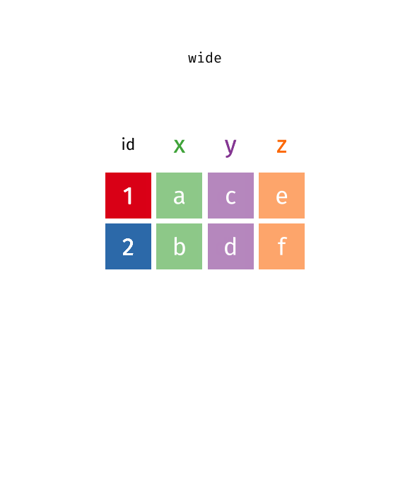
pivot_longer() function.You can tweak a plot forever, but at some point the tweaks are likely not very productive.
However, you should always be critical of defaultsand see if you can improve the plot to better portray your data / results / what you want to communicate.