Communication via Data Science
Lecture 10
May 8, 2026
Keep it simple
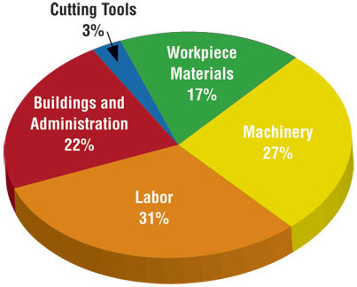
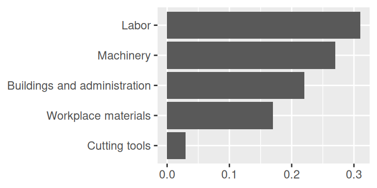
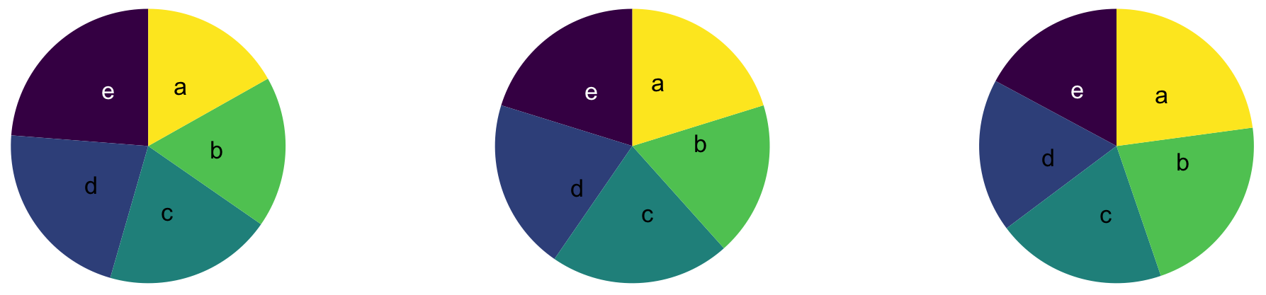
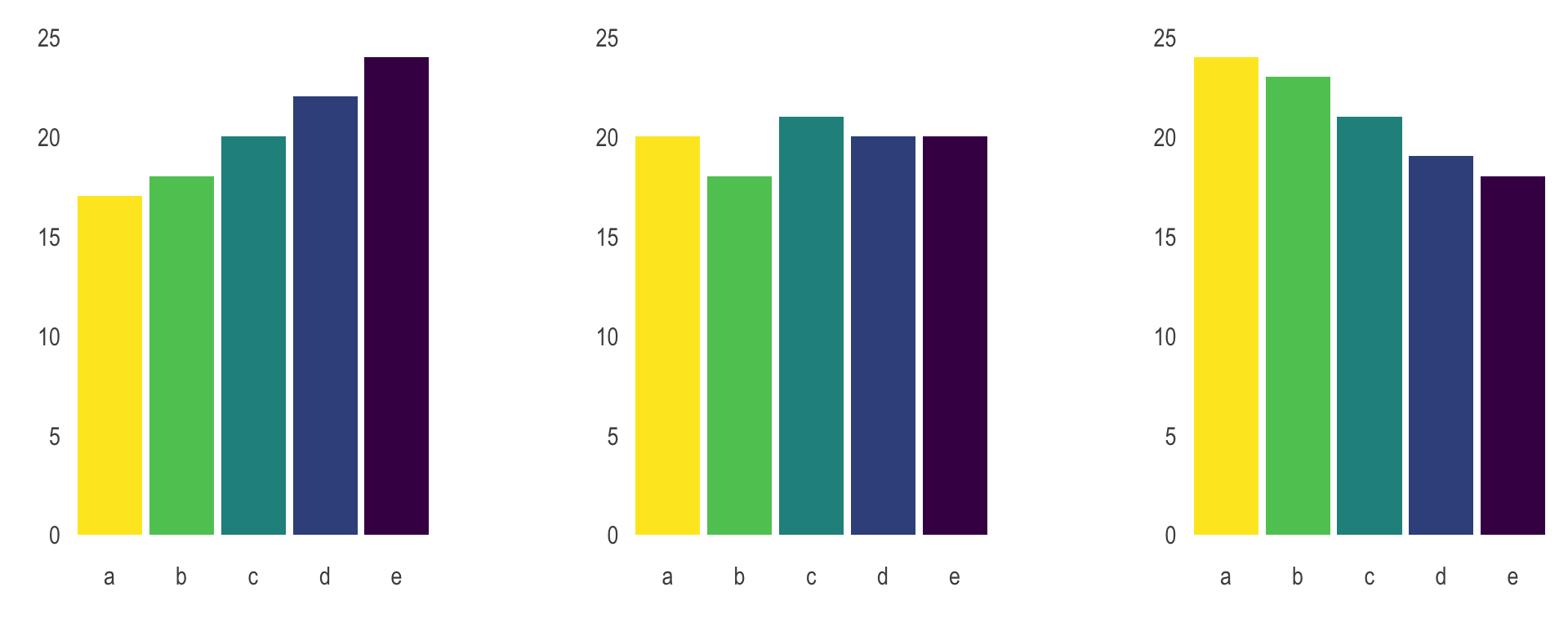
Judging relative area
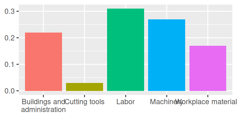
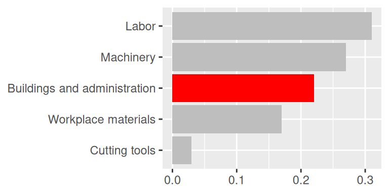
Use color to draw attention
Play with themes for a non-standard look
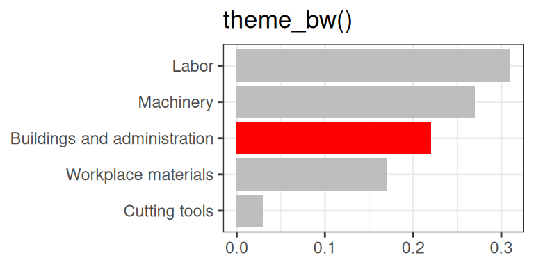
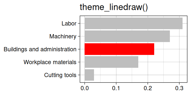
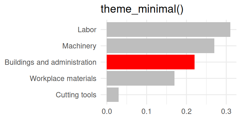
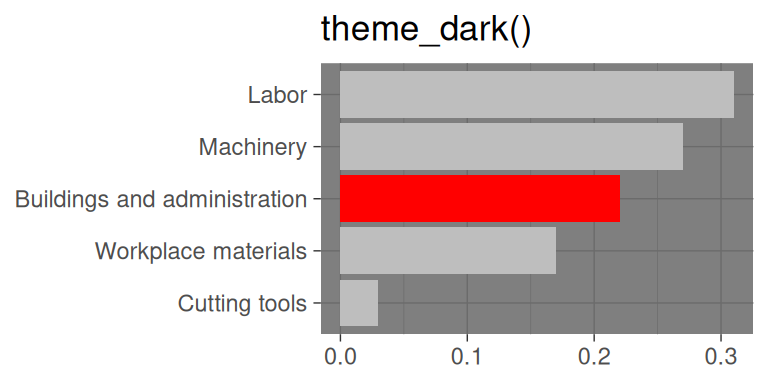
Go beyond ggplot2 themes – ggthemes
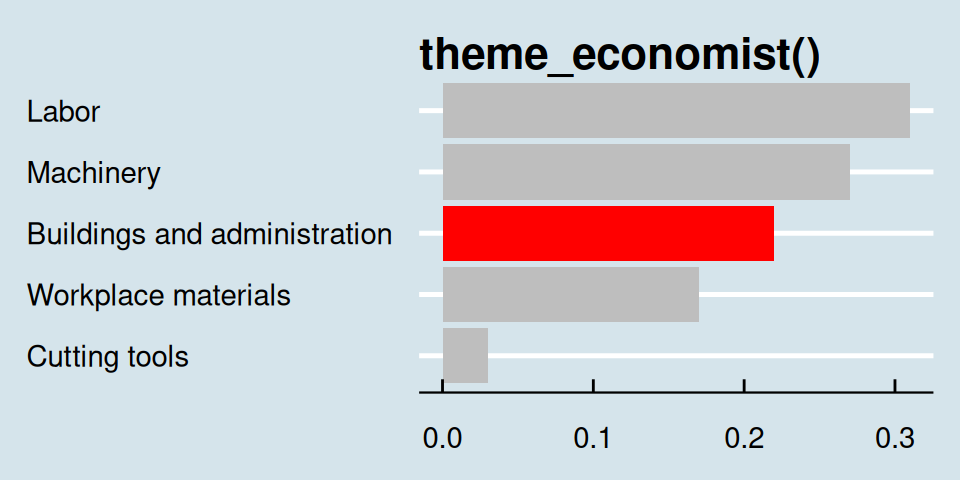
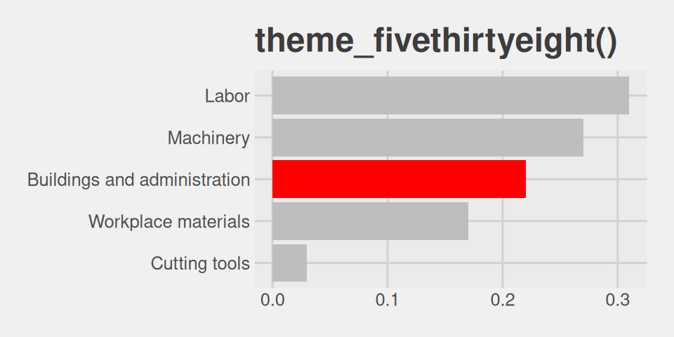
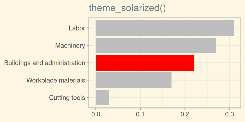
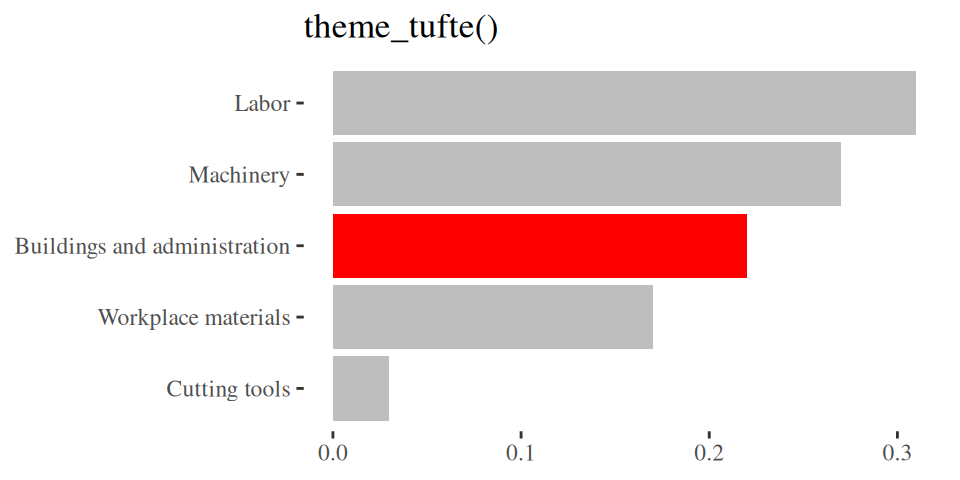
Tell a story
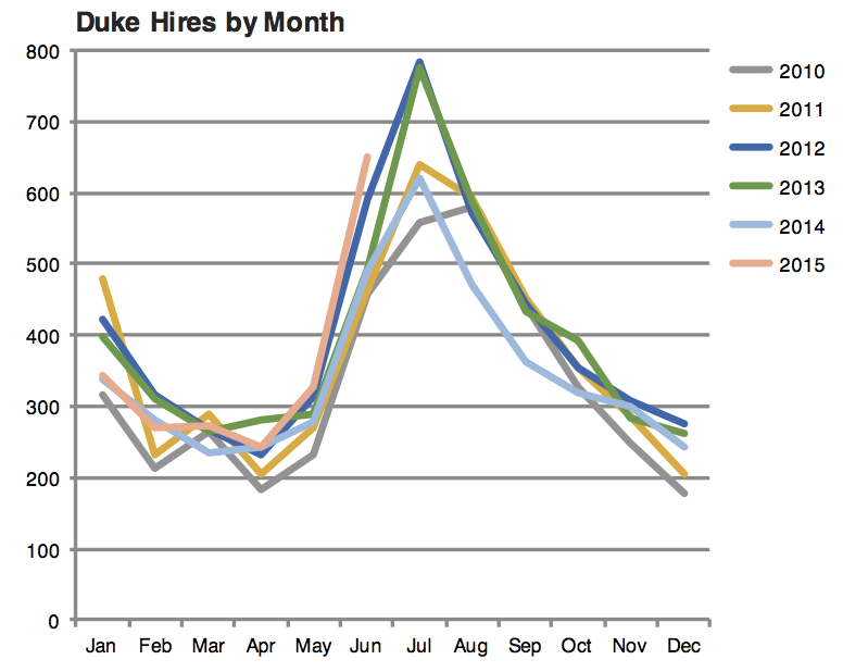
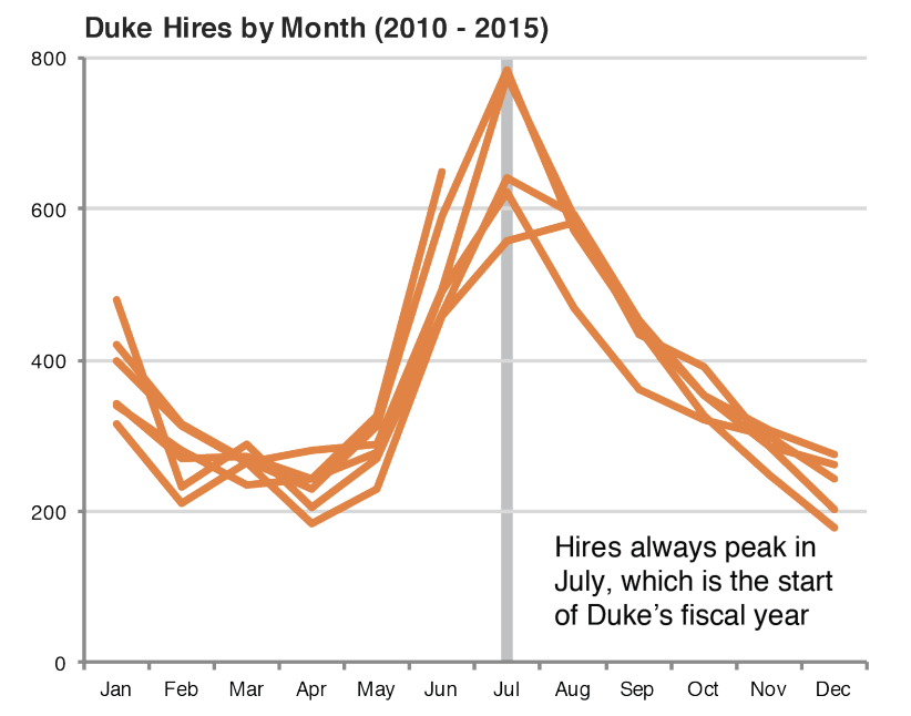
Leave out non-story details
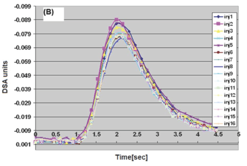
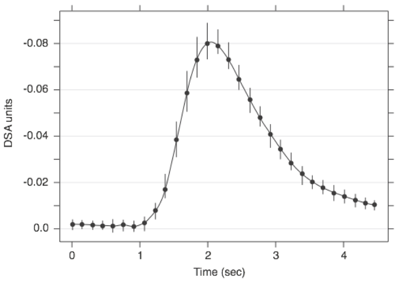
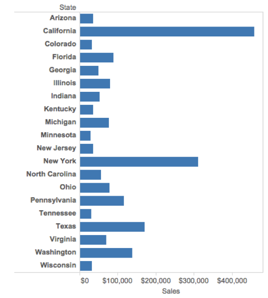
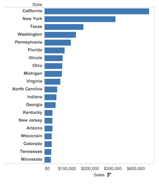
Order matters
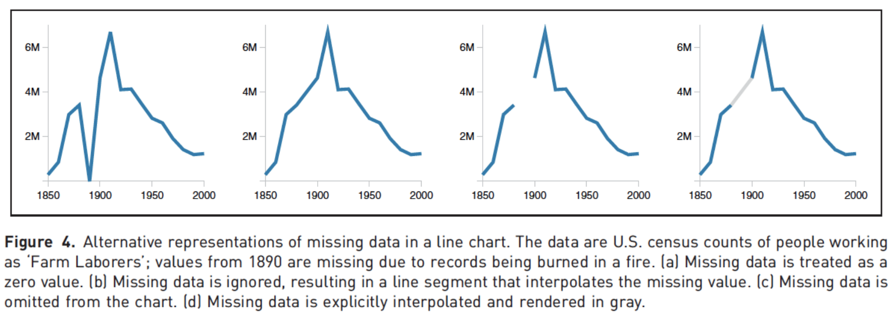
Clearly indicate missing data
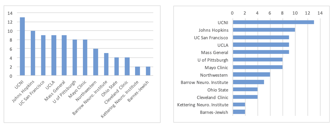
Reduce cognitive load
Use descriptive titles
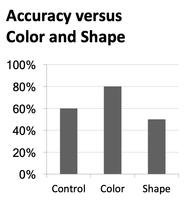
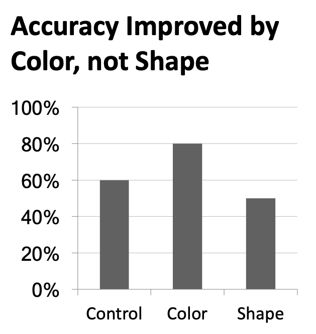
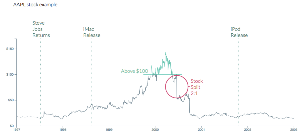
Annotate figures
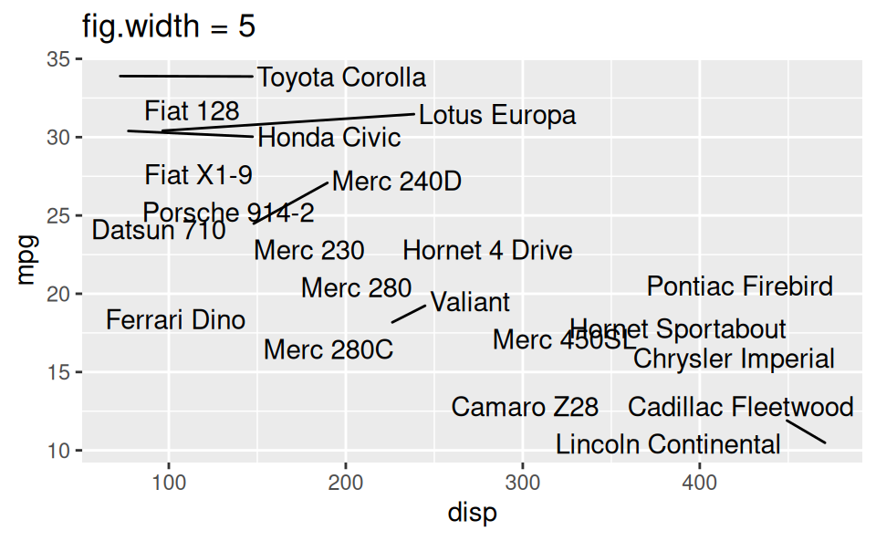
Small fig-width
For a zoomed-in look
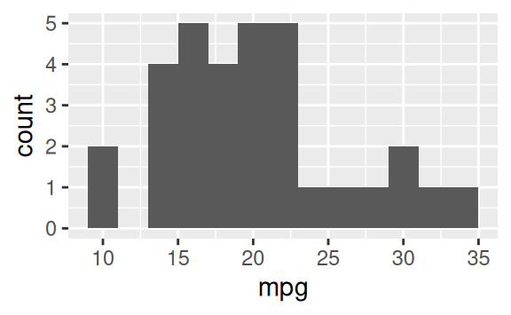
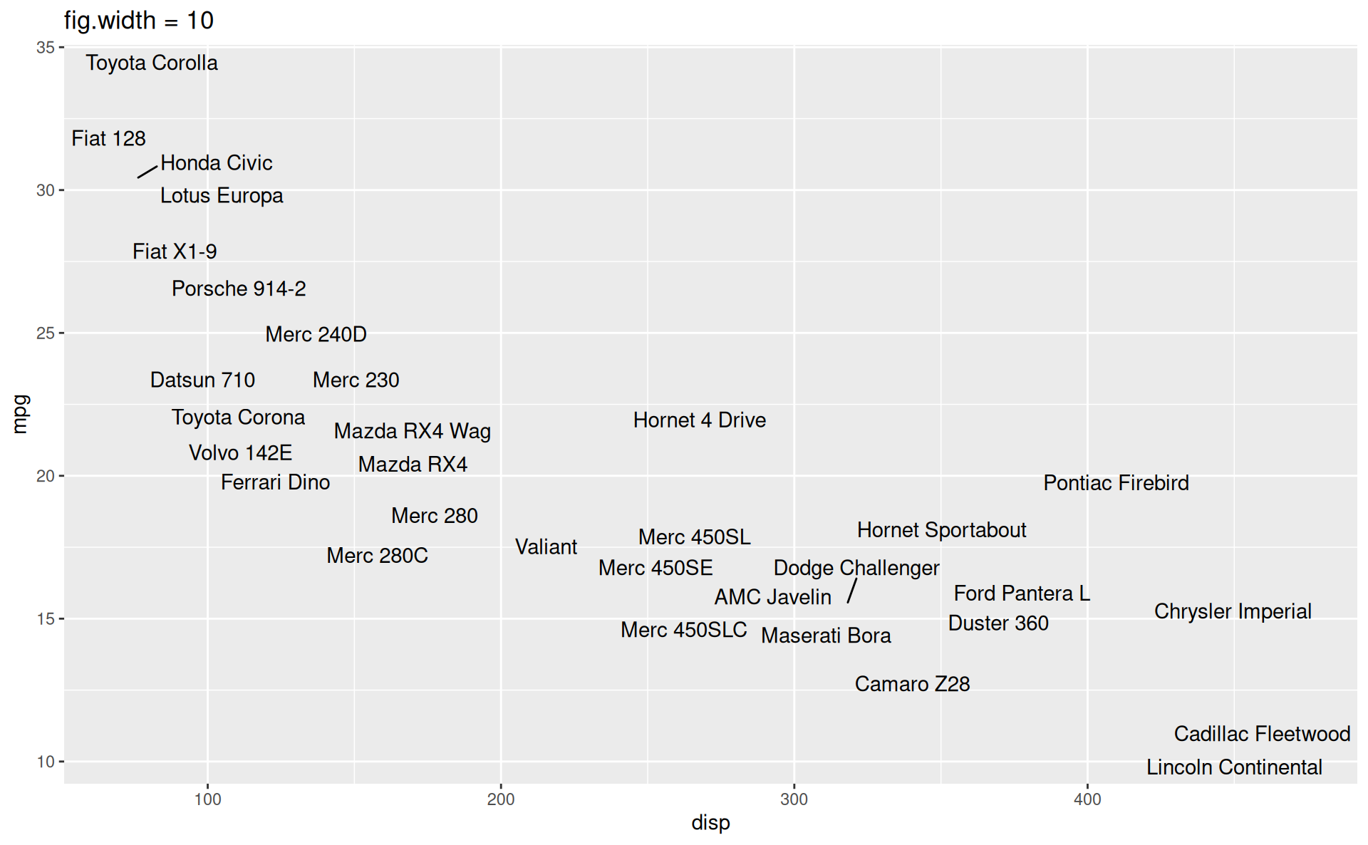
Large fig-width
For a zoomed-out look
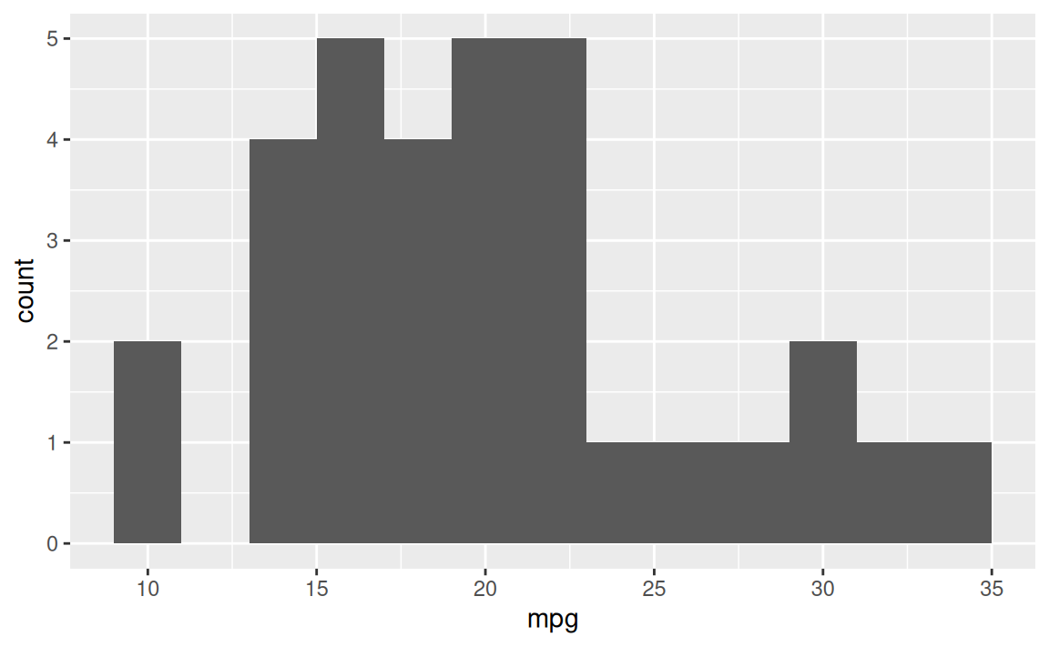
fig-width affects text size
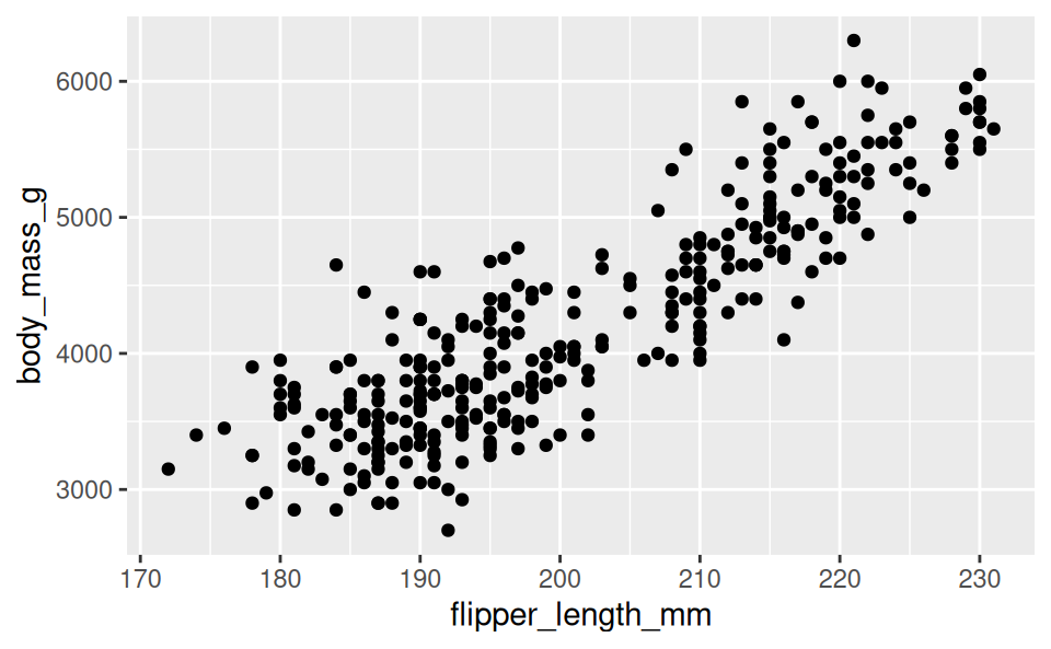
Cross referencing figures
As seen in Figure 1, there is a positive and relatively strong relationship between body mass and flipper length of penguins.
Going the extra mile
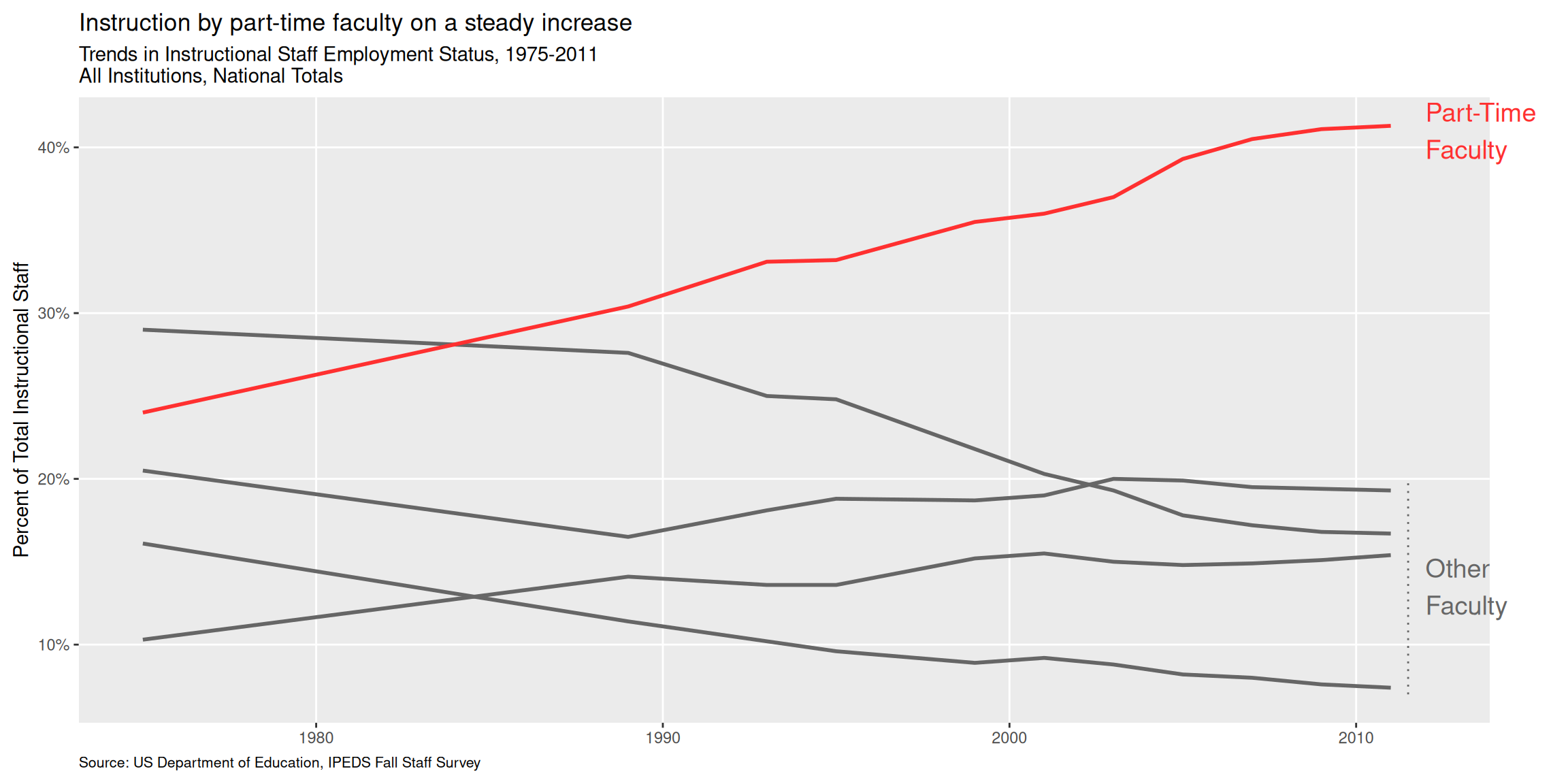
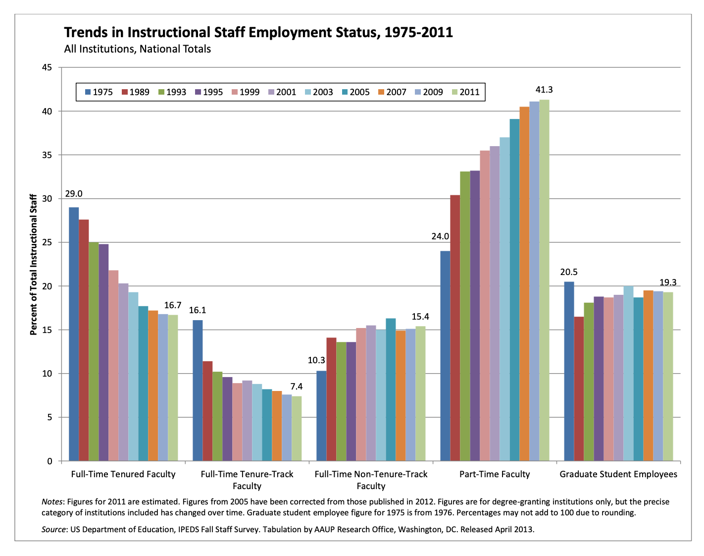
Trends in instructional staff employees at universities
The American Association of University Professors (AAUP) is a nonprofit membership association of faculty and other academic professionals. This report by the AAUP shows trends in instructional staff employees between 1975 and 2011, and contains the following image. What trends are apparent in this visualization?
Pick a purpose
Code
p <- ggplot(
  staff_long,
  aes(
    x = year,
    y = percentage,
    color = faculty_type_color, group = faculty_type
    )
  ) +
  geom_line(linewidth = 1, show.legend = FALSE) +
  labs(
    x = NULL,
    y = "Percent of Total Instructional Staff",
    color = NULL,
    title = "Trends in Instructional Staff Employment Status, 1975-2011",
    subtitle = "All Institutions, National Totals",
    caption = "Source: US Department of Education, IPEDS Fall Staff Survey"
  ) +
  scale_y_continuous(labels = label_percent(accuracy = 1, scale = 1)) +
  scale_color_identity() +
  theme(
    plot.caption = element_text(size = 8, hjust = 0),
    plot.margin = margin(0.1, 0.6, 0.1, 0.1, unit = "in")
  ) +
  coord_cartesian(clip = "off") +
  annotate(
    geom = "text",
    x = 2012, y = 41, label = "Part-Time\nFaculty",
    color = "firebrick1", hjust = "left", size = 5
  ) +
  annotate(
    geom = "text",
    x = 2012, y = 13.5, label = "Other\nFaculty",
    color = "gray40", hjust = "left", size = 5
  ) +
  annotate(
    geom = "segment",
    x = 2011.5, xend = 2011.5,
    y = 7, yend = 20,
    color = "gray40", linetype = "dotted"
  )

p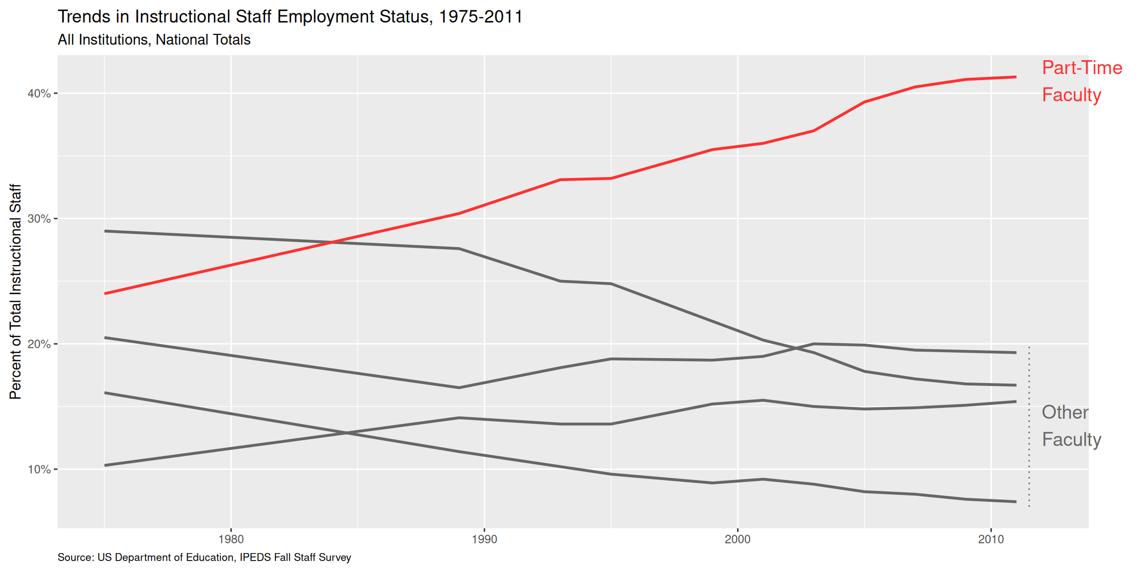
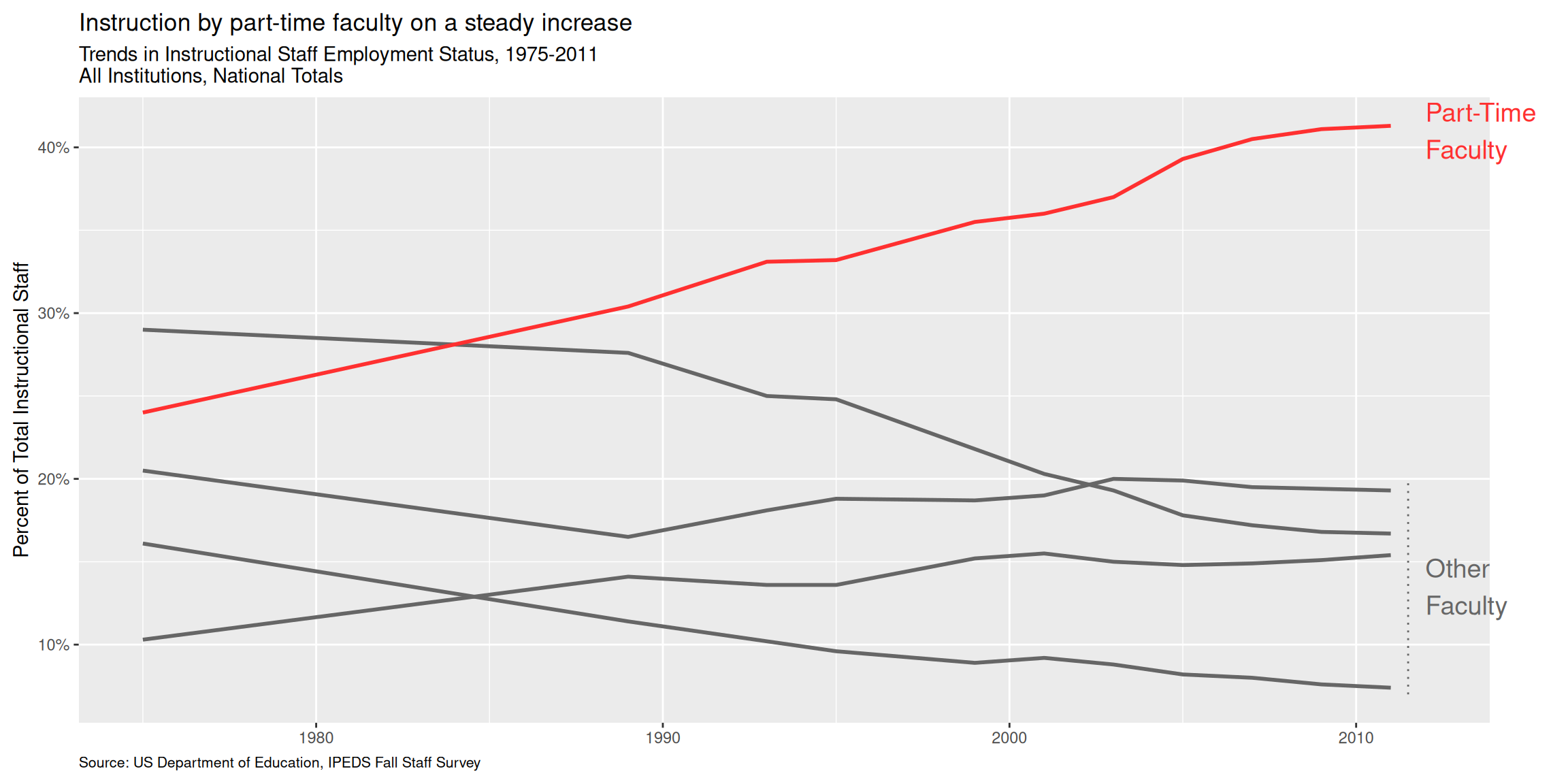
Use labels to communicate the message
Code
p +
  labs(
    title = "Instruction by part-time faculty on a steady increase",
    subtitle = "Trends in Instructional Staff Employment Status, 1975-2011\nAll Institutions, National Totals",
    caption = "Source: US Department of Education, IPEDS Fall Staff Survey",
    y = "Percent of Total Instructional Staff",
    x = NULL
  )
Simplify
Code
p +
  labs(
    title = "Instruction by part-time faculty on a steady increase",
    subtitle = "Trends in Instructional Staff Employment Status, 1975-2011\nAll Institutions, National Totals",
    caption = "Source: US Department of Education, IPEDS Fall Staff Survey",
    y = "Percent of Total Instructional Staff",
    x = NULL
  ) +
  theme(panel.grid.minor = element_blank())