Inference Overview
Lecture 20
June 17, 2026
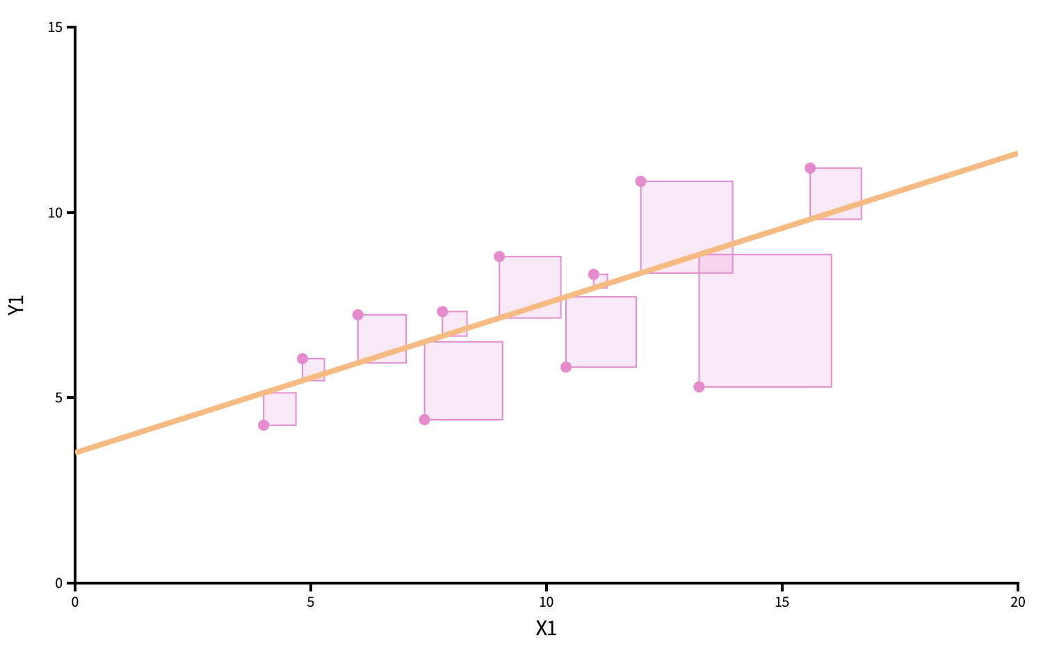
Point estimation (roman letters, hats!)
We estimate \(\beta_0\) and \(\beta_1\) with the coefficients of the best fit line:
\[ \widehat{y}=b_0+b_1x. \]
“Best” means “least squares.” We pick the estimates so that the sum of squared residuals is as small as possible. Play around!
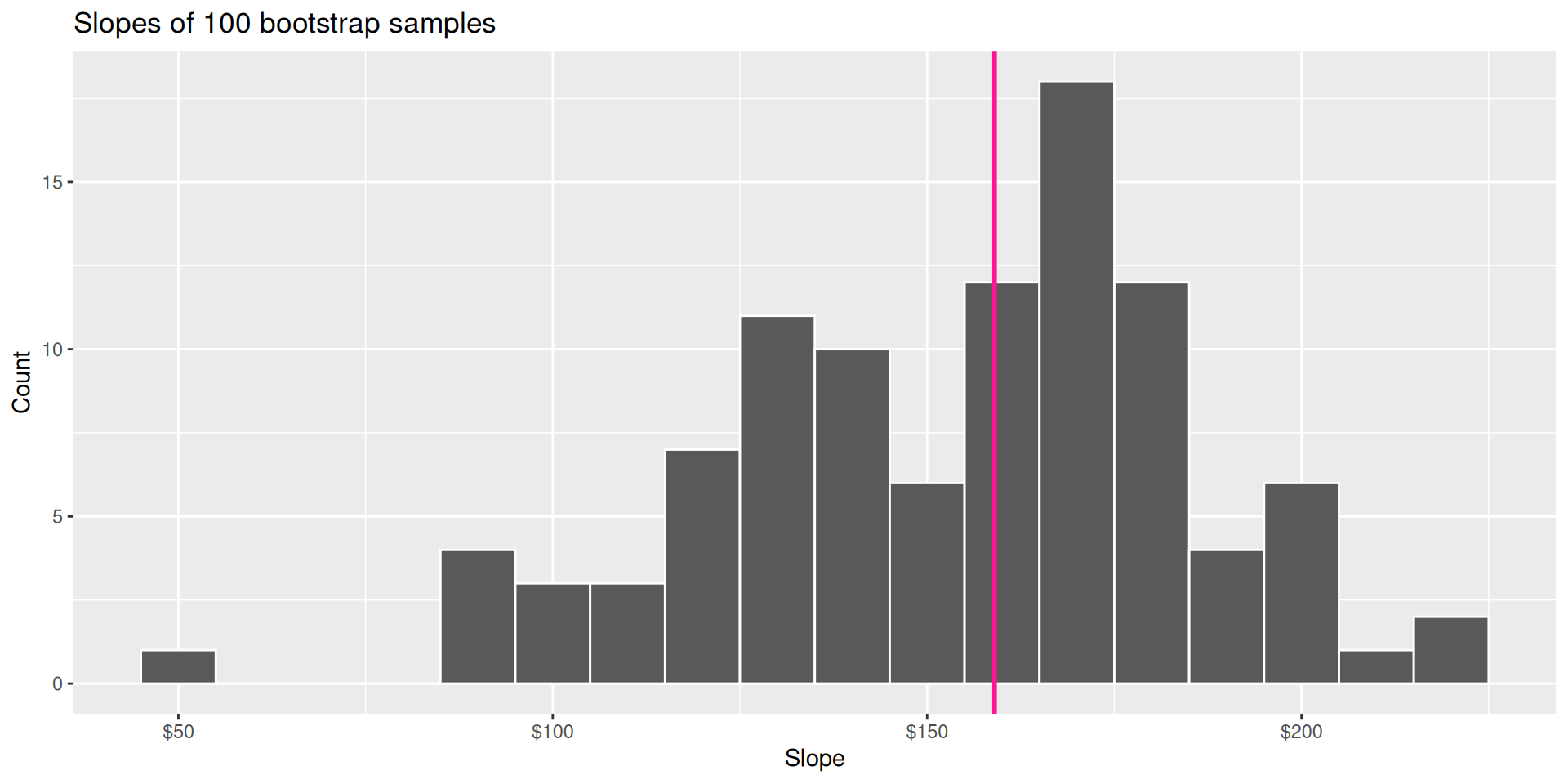
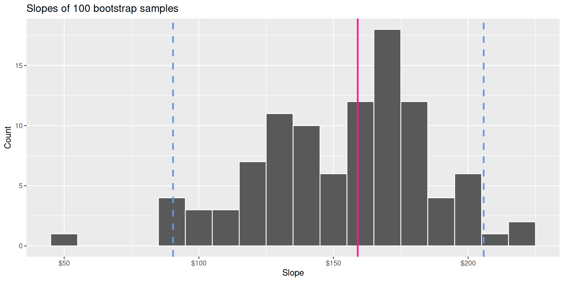
Bootstrap distribution
This histogram displays variation in the slope estimate across alternative datasets.
- Large spread \(\rightarrow\) high uncertainty;
- Small spread \(\rightarrow\) lower uncertainty.
Confidence interval
Pick a range that swallows up a large % of the histogram:
We use quantiles (think IQR), but there are other ways.
Null distribution
If the null happened to be true, how would we expect our results to vary across datasets? We can use simulation to answer this:
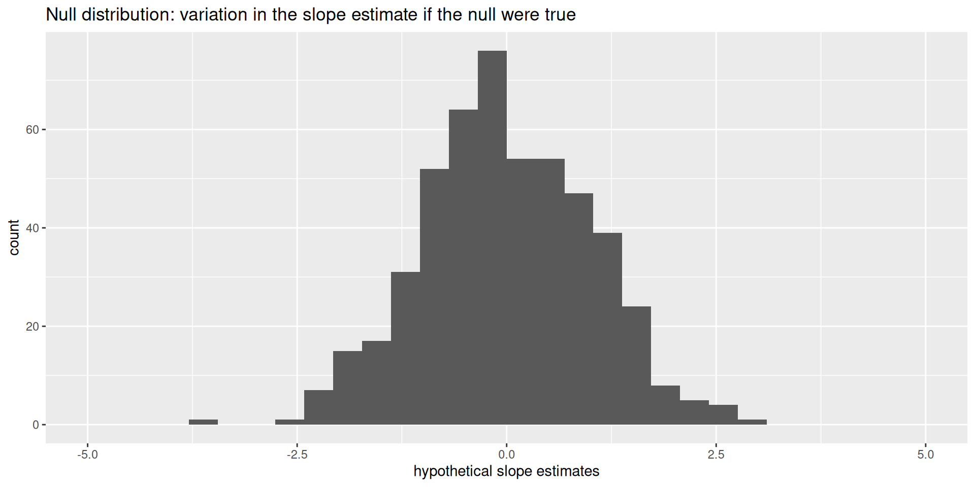
This is how the world should look if the null is true.
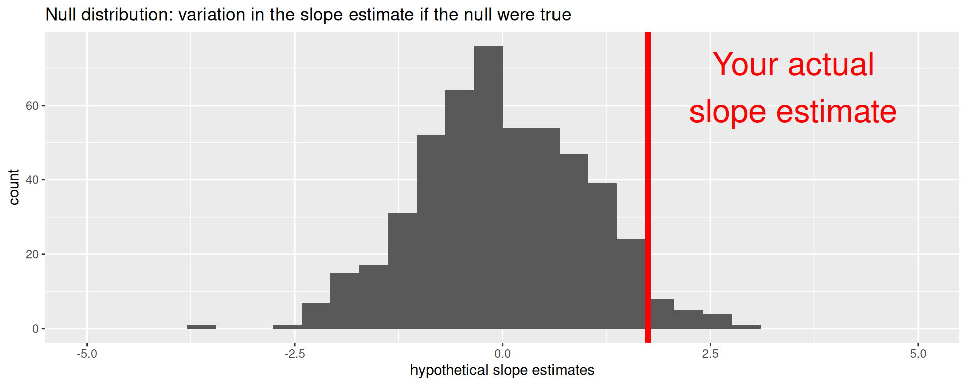
Null distribution versus reality
Locate the actual results of your actual data analysis under the null distribution. Are they in the middle? Are they in the tails?
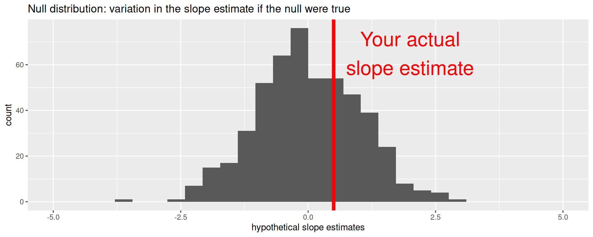
Are these results in harmony or conflict with the null?
Null distribution versus reality
Locate the actual results of your actual data analysis under the null distribution. Are they in the middle? Are they in the tails?
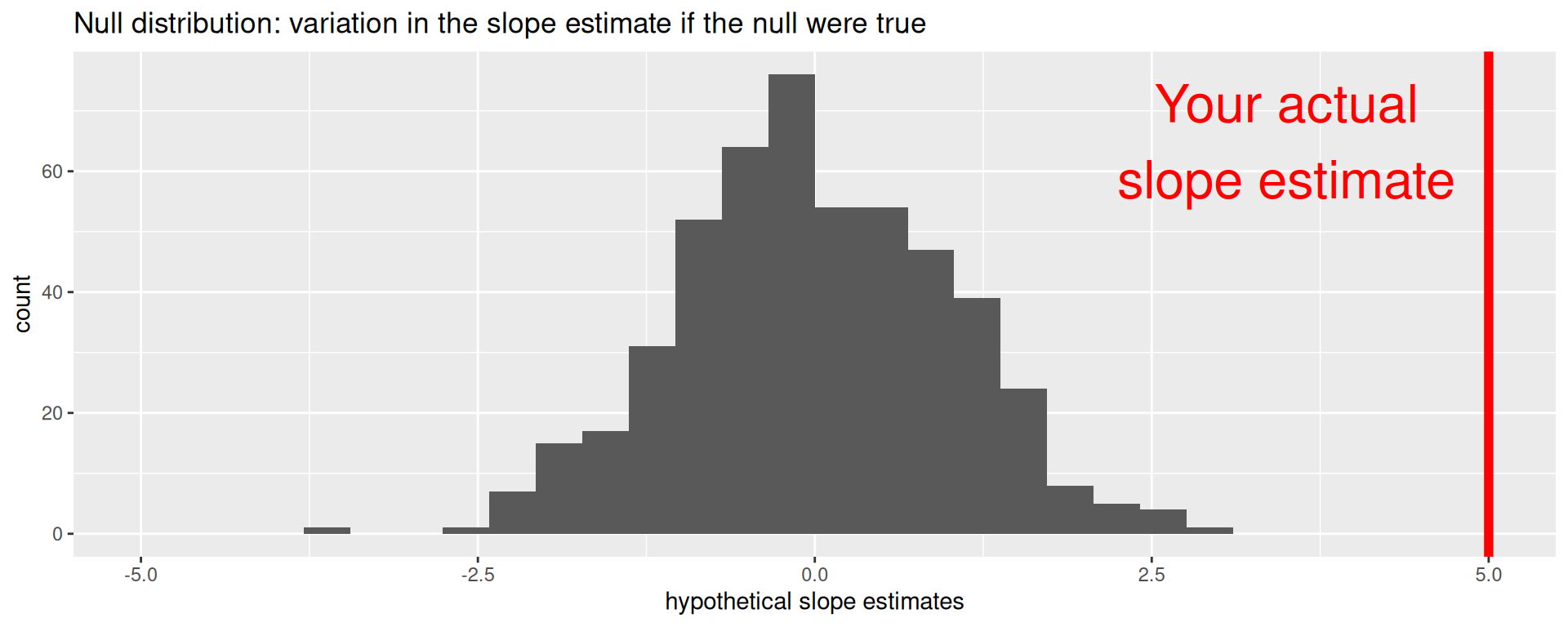
Are these results in harmony or in conflict with the null?
Null distribution versus reality
Locate the actual results of your actual data analysis under the null distribution. Are they in the middle? Are they in the tails?
Are these results in harmony or in conflict with the null?
p-value
p-value is the fraction of the histogram area shaded red:
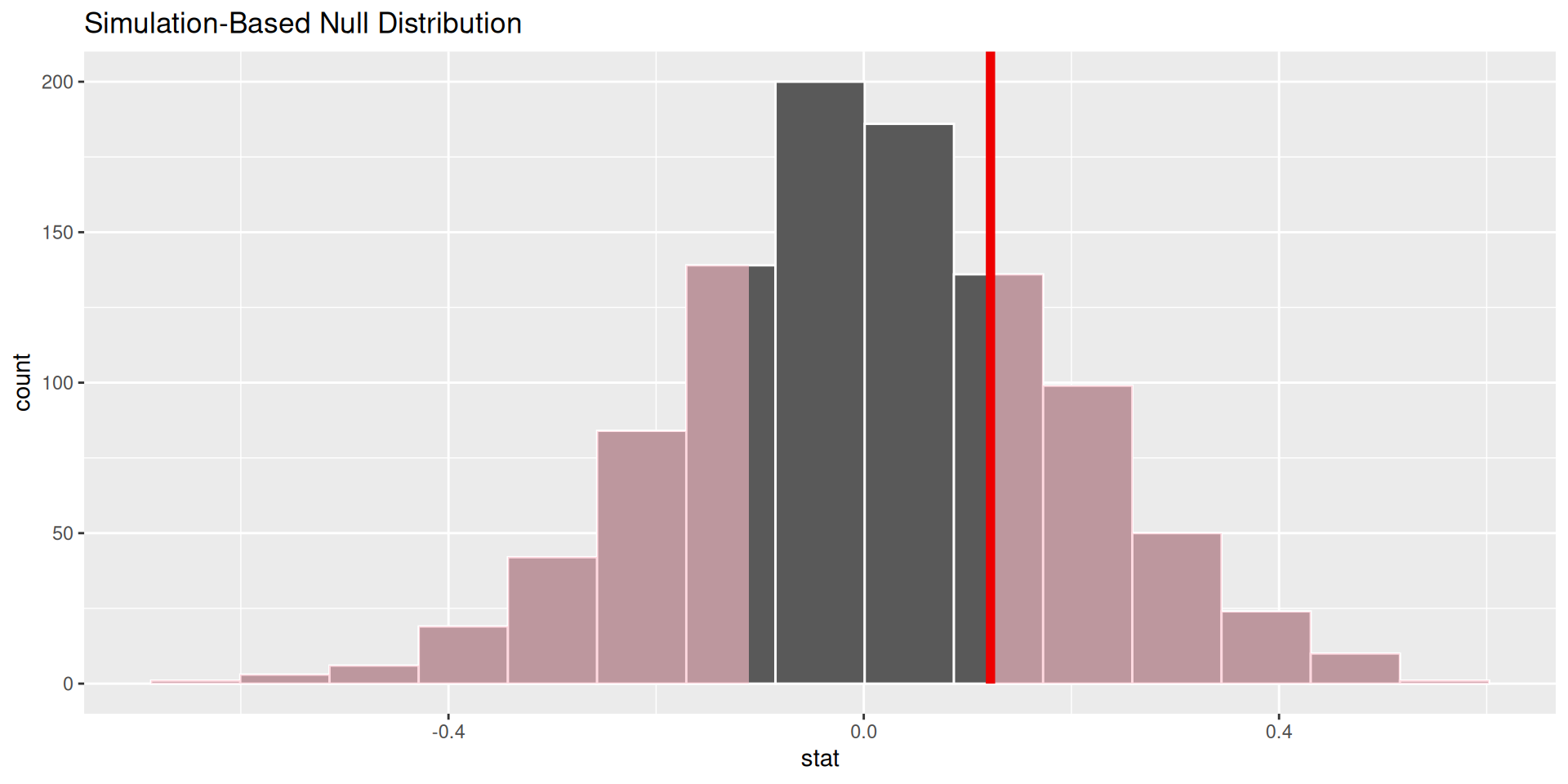
Big ol’ p-value. Null remains plausible
p-value
p-value is the fraction of the histogram area shaded red:
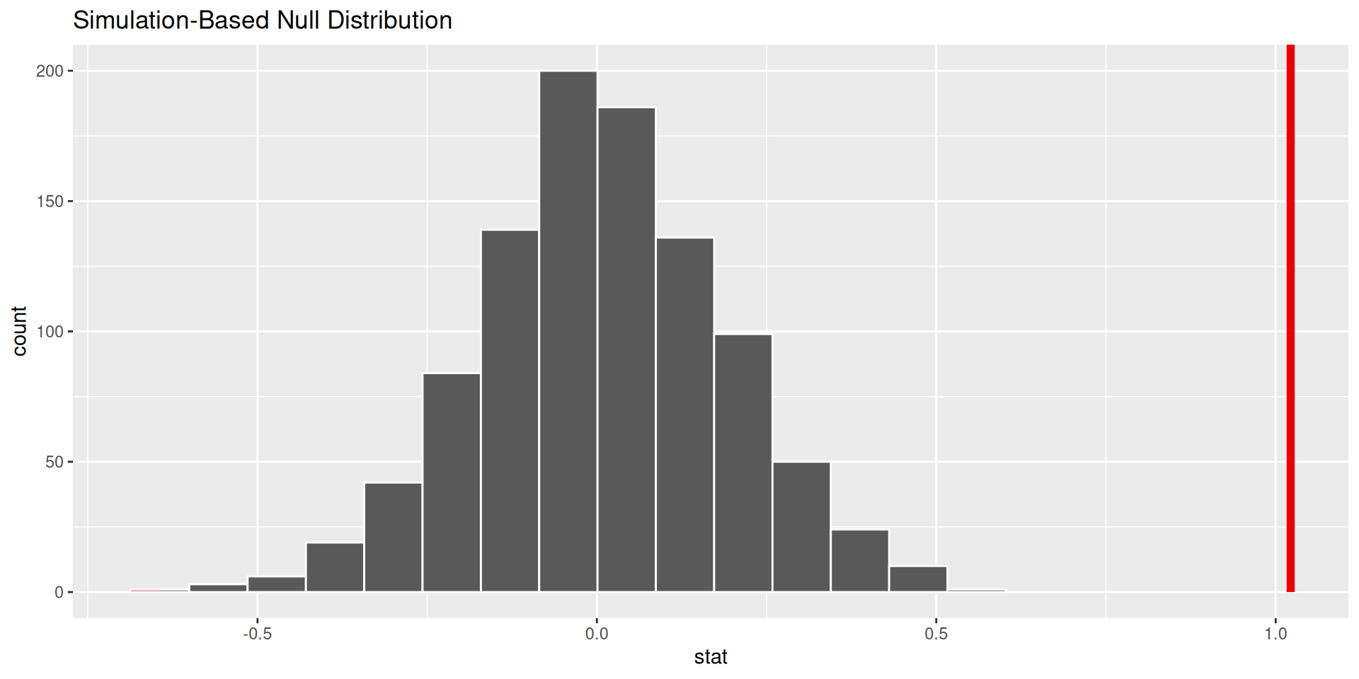
p-value is basically zero. Null looks bogus.
p-value
p-value is the fraction of the histogram area shaded red:
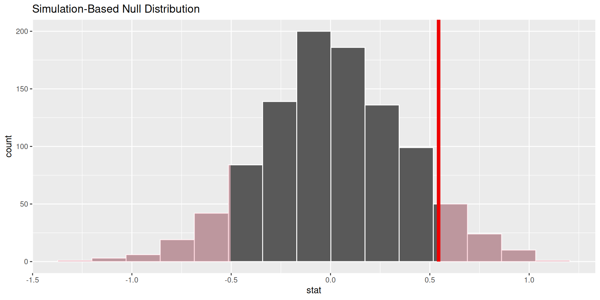
p-value is…kinda small? Null looks…?
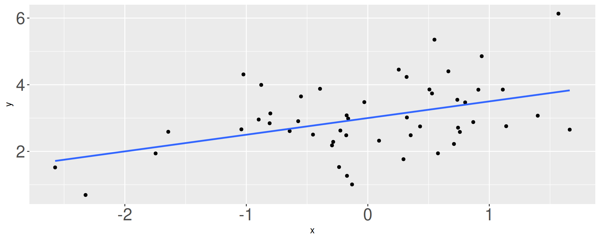
What is \(b_1\)?
- -1 / 2
- 0
- 1 / 4
- 1 / 2
- 1
- 2
What is \(b_0\)?

- 1
- 1.75
- 2
- 3
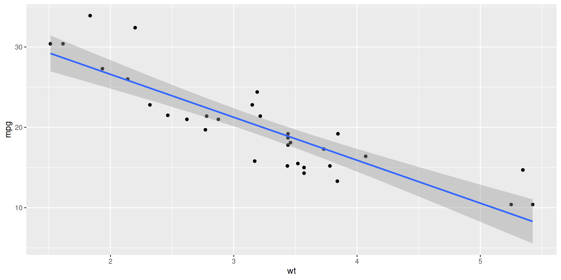
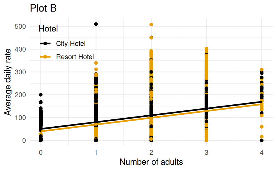
Back to the Hotels!
Which of the following (Plot A or Plot B) is the correct visual representation of this model?
# A tibble: 3 × 5
  term              estimate std.error statistic   p.value
  <chr>                <dbl>     <dbl>     <dbl>     <dbl>
1 (Intercept)           50.2     0.606      82.8 0
2 adults                29.7     0.312      95.4 0
3 hotelResort Hotel    -10.6     0.323     -32.8 6.78e-235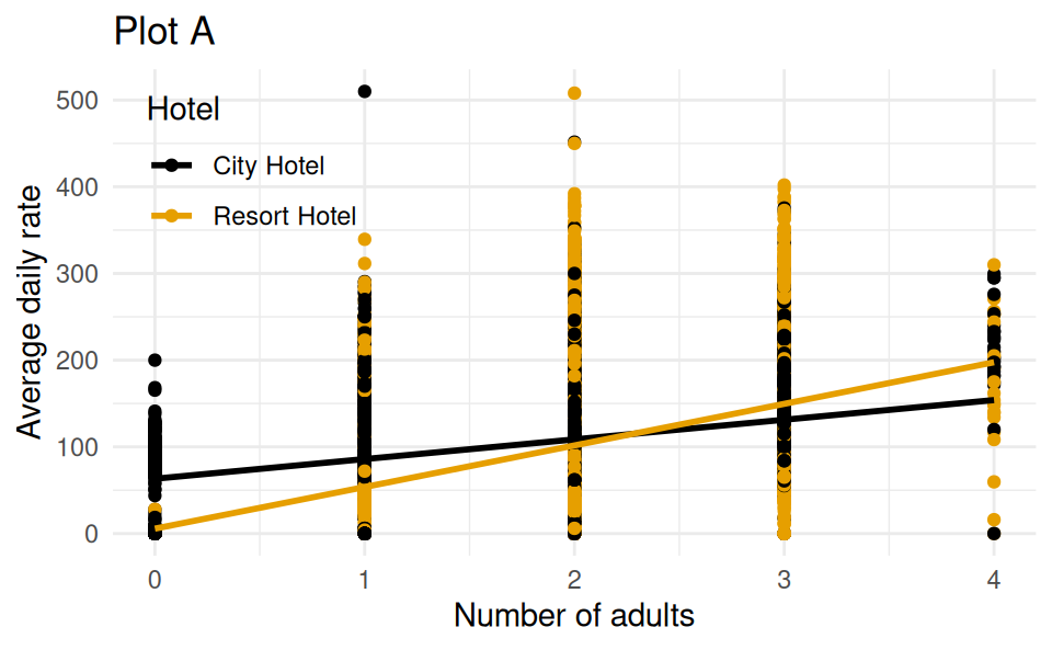
Which is a 98% confidence interval?
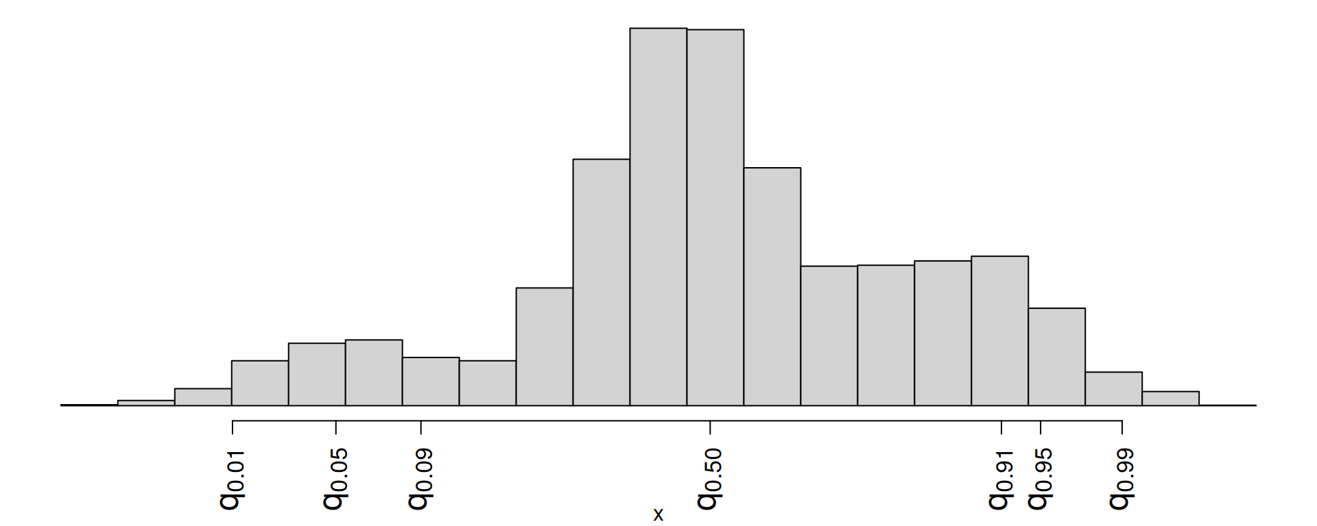
- \((q_{0.01},\,q_{0.91})\)
- \((q_{0.01},\,q_{0.99})\)
- \((q_{0.09},\,q_{0.95})\)
- \((q_{0.05},\,q_{0.99})\)
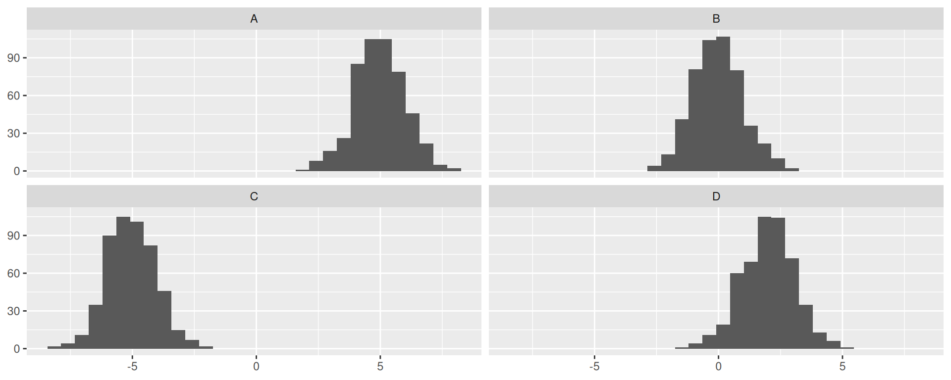
Match the picture to the p-value.
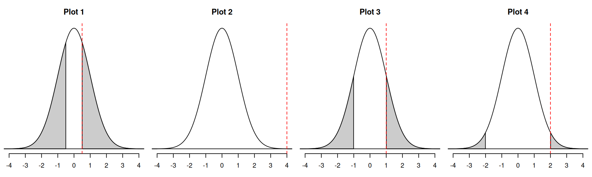
- 0
- 0.045
- 0.32
- 0.62
Which could be the null distribution of the test?
For these hypotheses
\[ \begin{aligned} H_0&: \beta_1=5\\ H_A&: \beta_1\neq 5. \end{aligned} \]