Communication via Data Science
Lecture 10
Wrap-Up AE-09
Project
The bottom line, at the top
Cohesive, thoughtful analysis of a dataset of your team’s choosing (subject to instructor / TA approval) drawing on & expanding upon the techniques / methods learned in this course
- Goal: Create a reproducible written report that introduces your research question, explains the methodology, showcases results, and discusses the implications of your work; present your work / findings to your peers and teaching team with engagig, concise slides
- Put differently… write an in-depth article that might appear in the popular press (NYT, Chronicle, etc)…
- For an audience that is intelligent, but non-technical and unfamiliar with the domain
- Emphasize clear communication, attractive and informative graphics, and carefully chosen numerical summaries and / or statistical methods
-
Rcode and raw output should not appear in your final writeup (i.e., you will need to suppress your code chunks via Quarto settings) - All figures and tables should be labeled with captions
Telling a story
Setup
Multiple ways of telling a story
Sequential reveal: Motivation, then resolution
Instant reveal: Resolution, and motivation hidden within
Simplicity vs. complexity
When you’re trying to show too much data at once you may end up not showing anything.
Never assume your audience can rapidly process complex visual displays
Don’t add variables to your plot that are tangential to your story
Don’t jump straight to a highly complex figure; first show an easily digestible subset (e.g., show one facet first)
Aim for memorable, but clear
Consistency vs. repetitiveness
Be consistent but don’t be repetitive.
Use consistent features throughout plots (e.g., same color represents same level on all plots)
Aim to use a different type of summary or visualization for each distinct analysis
Reading a report with ALL boxplots is like walking into an ice cream shoppe that only sells versions of vanilla (e.g., Madagascar, Vanilla Bean (the best), French Vanilla, Old Fashioned, etc…) when I want a scoop of coffee and a scoop of cinnamon!
Designing effective visualizations
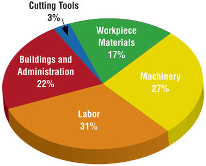
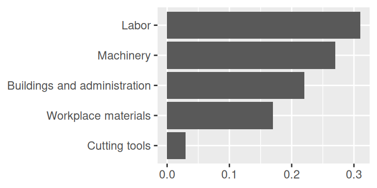
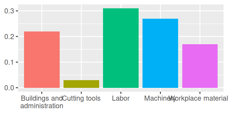
Data
d <- tribble(
  ~category,                     ~value,
  "Cutting tools"                , 0.03,
  "Buildings and administration" , 0.22,
  "Labor"                        , 0.31,
  "Machinery"                    , 0.27,
  "Workplace materials"          , 0.17
)
d
# A tibble: 5 × 2
category value
<chr> <dbl>
1 Cutting tools 0.03
2 Buildings and administration 0.22
3 Labor 0.31
4 Machinery 0.27
5 Workplace materials 0.17Keep it simple
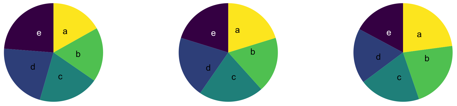
Judging relative area
. . .
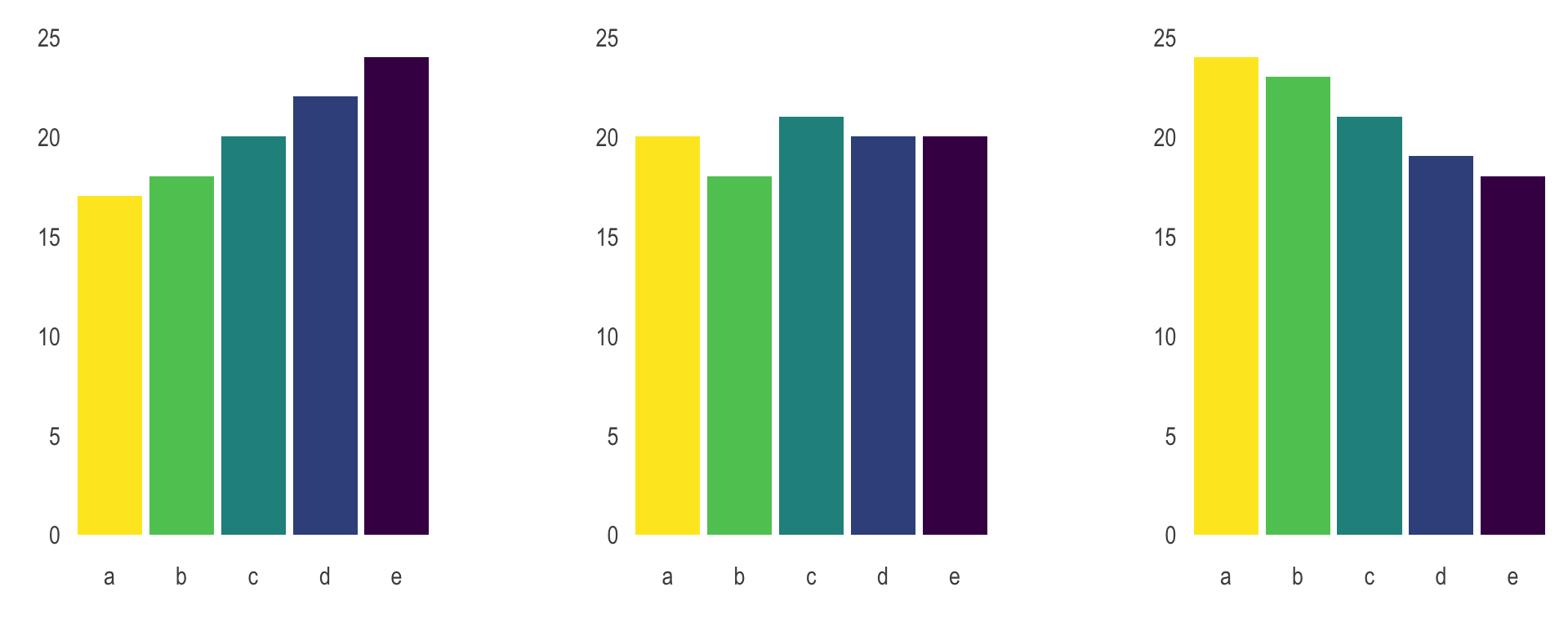
From Data to Viz caveat collection - The issue with the pie chart
Use color to draw attention
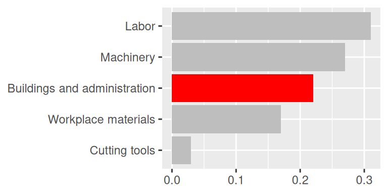
Play with themes for a non-standard look
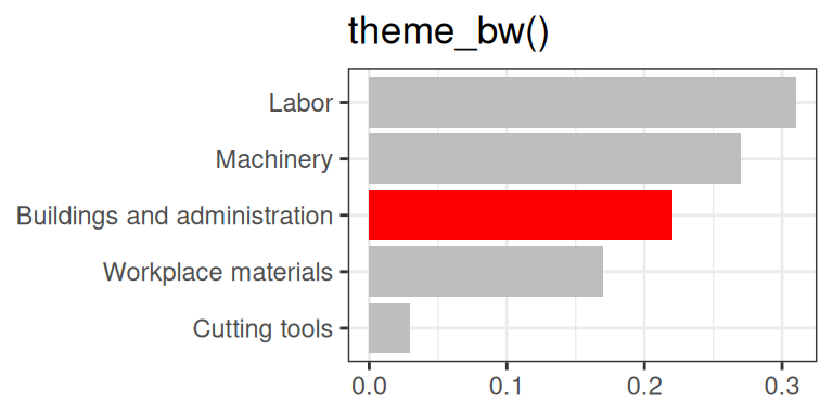
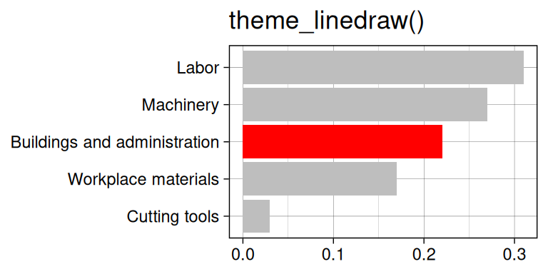
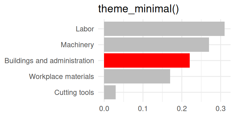
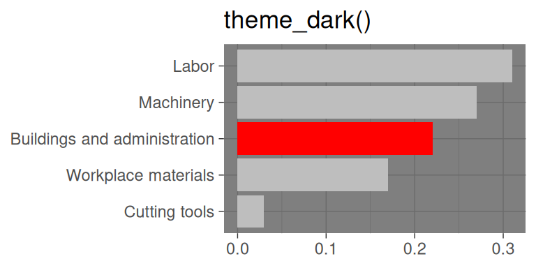
Go beyond ggplot2 themes – ggthemes
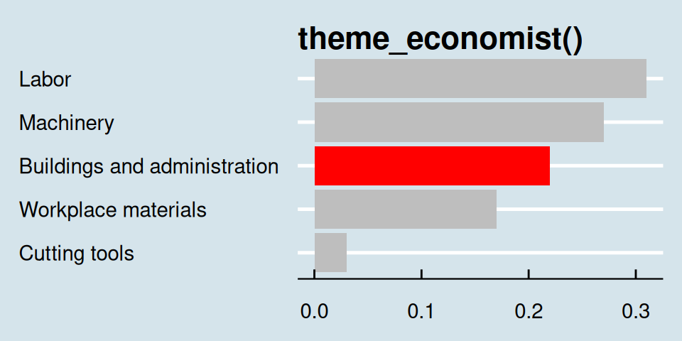
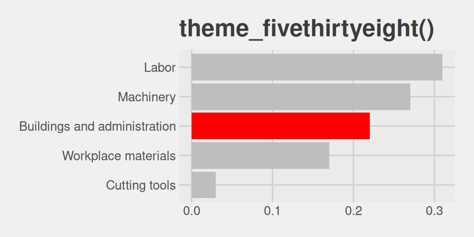
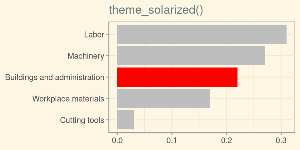
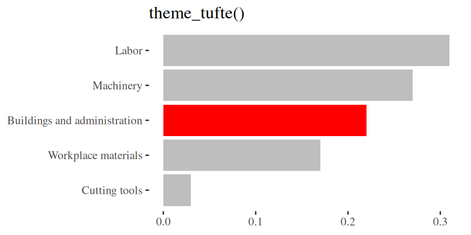
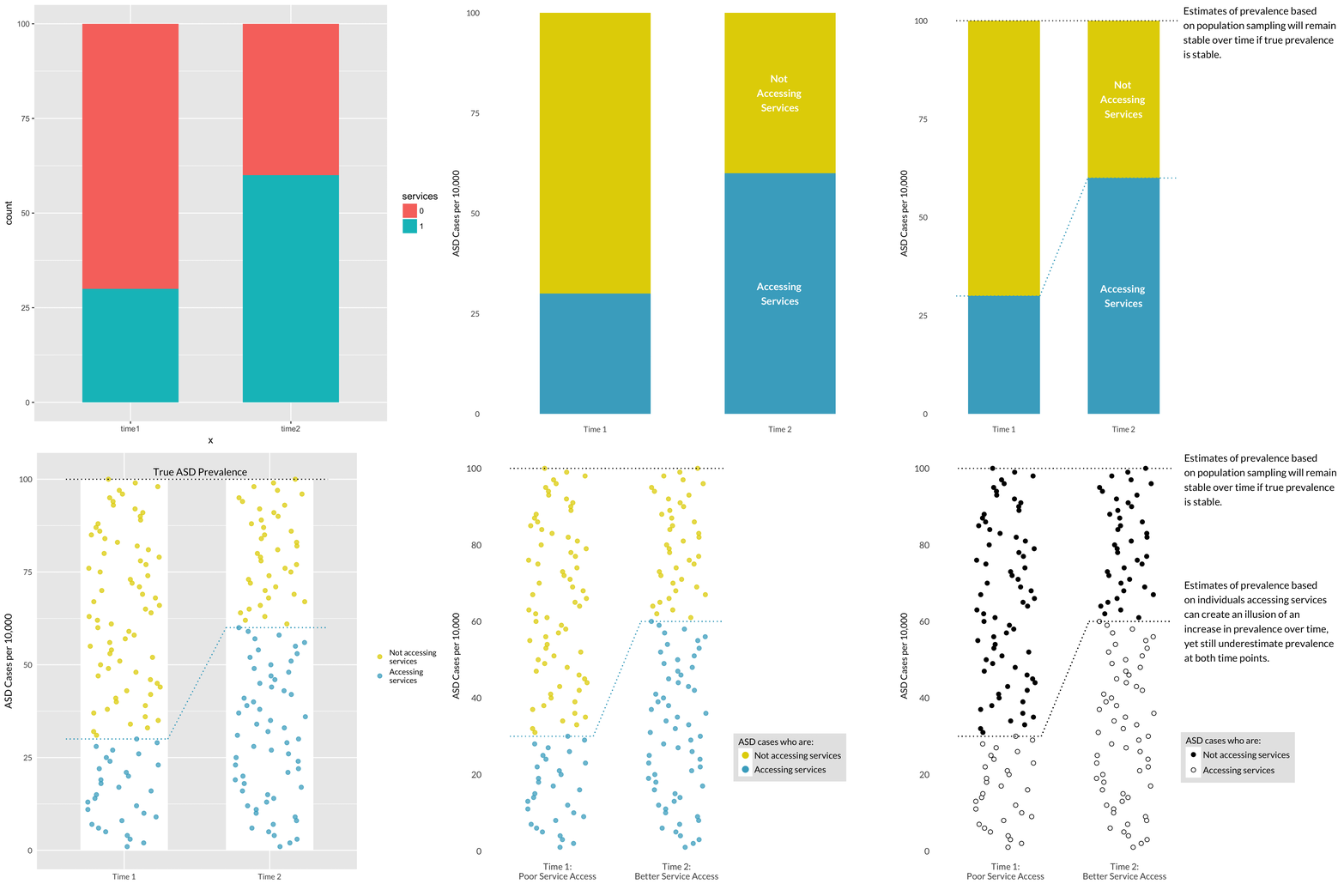
Tell a story
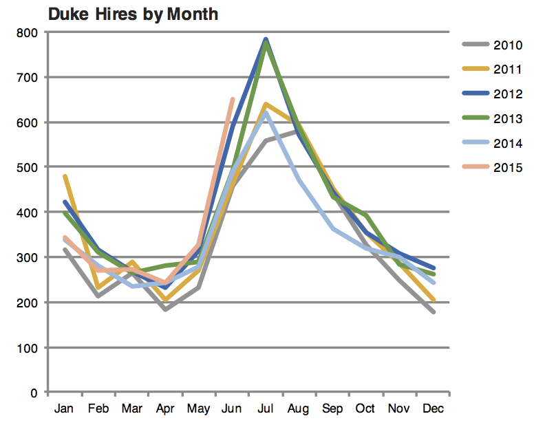
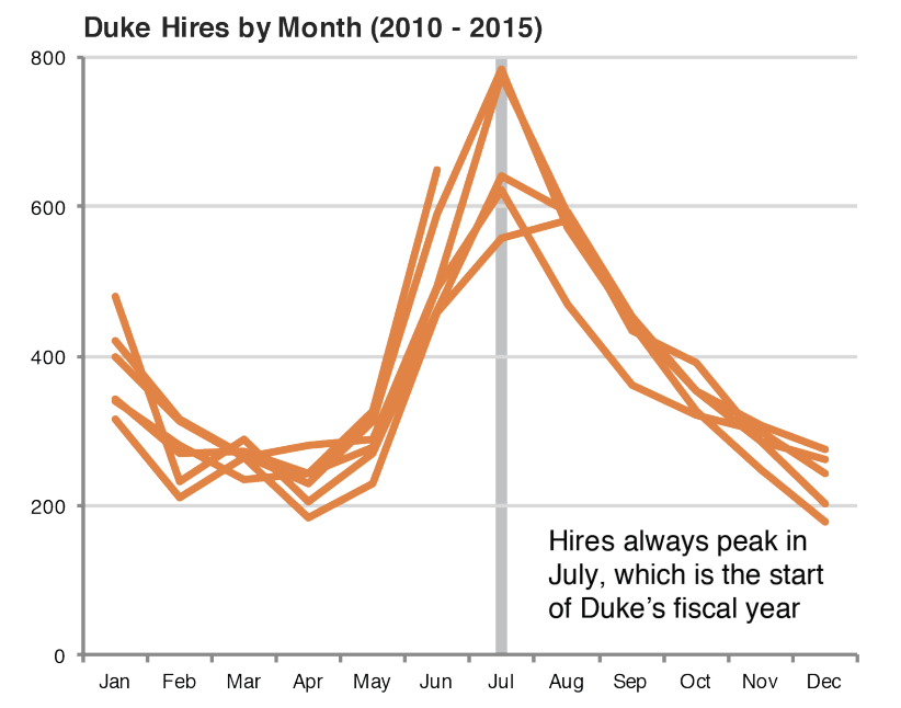
Credit: Angela Zoss and Eric Monson, Duke DVS
Leave out non-story details
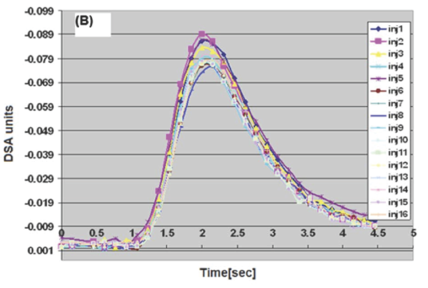
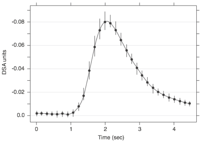
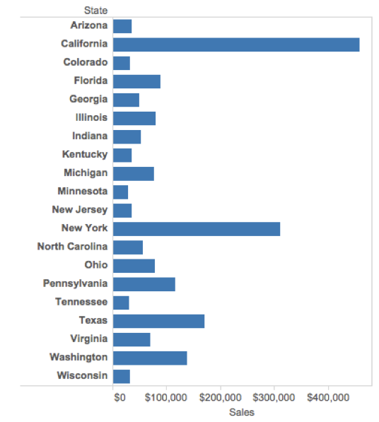
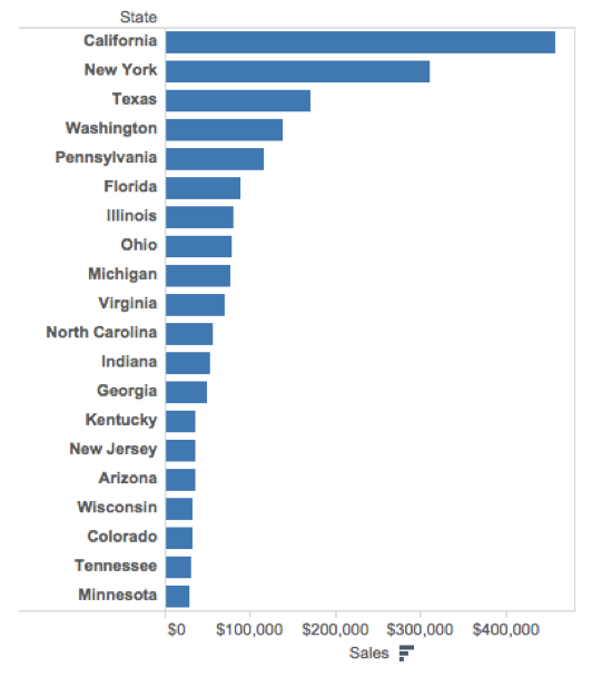
Order matters
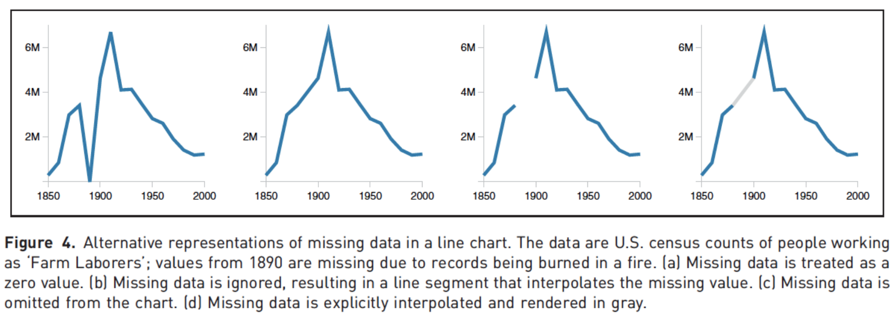
Clearly indicate missing data
Reduce cognitive load
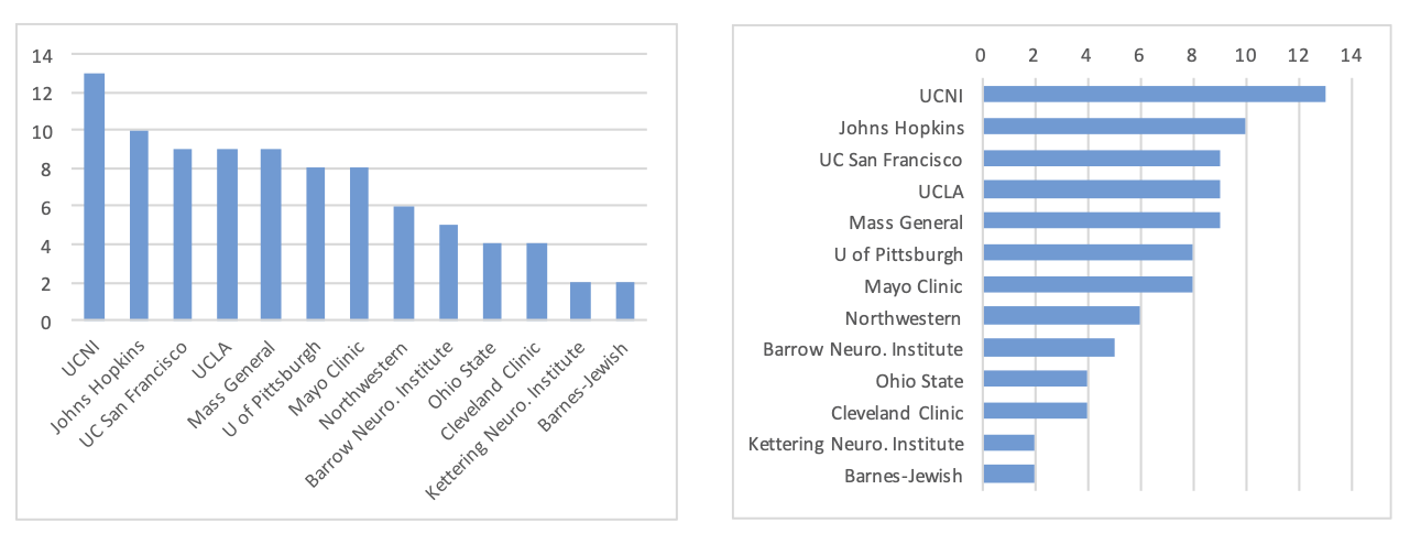
http://www.storytellingwithdata.com/2012/09/some-finer-points-of-data-visualization.html
Use descriptive titles
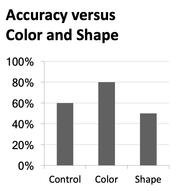
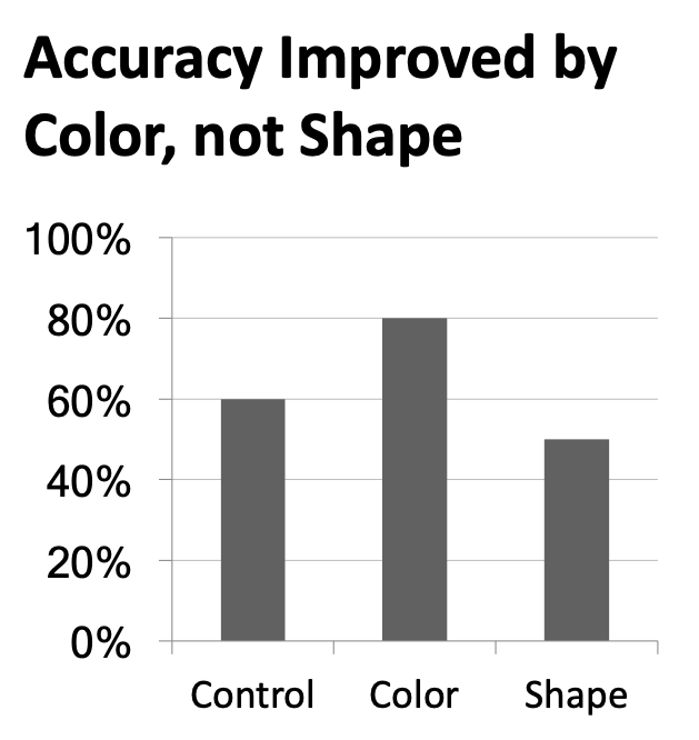
Annotate figures
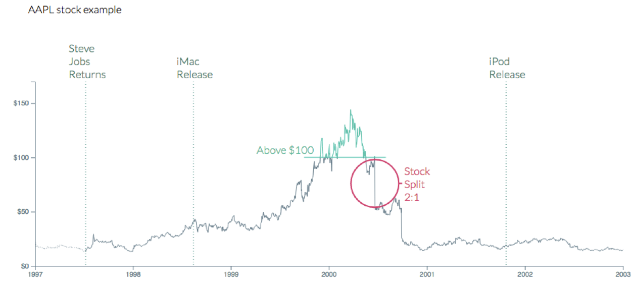
https://bl.ocks.org/susielu/23dc3082669ee026c552b85081d90976
Plot sizing and layout
Sample plots
p_hist <- ggplot(mtcars, aes(x = mpg)) +
  geom_histogram(binwidth = 2)

p_text <- mtcars |>
  rownames_to_column() |>
  ggplot(aes(x = disp, y = mpg)) +
  geom_text_repel(aes(label = rowname)) +
  coord_cartesian(clip = "off")
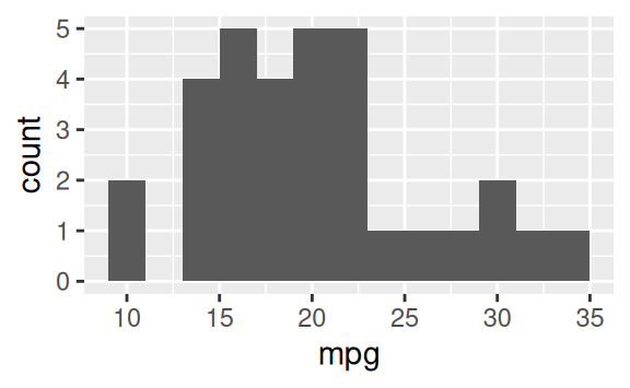
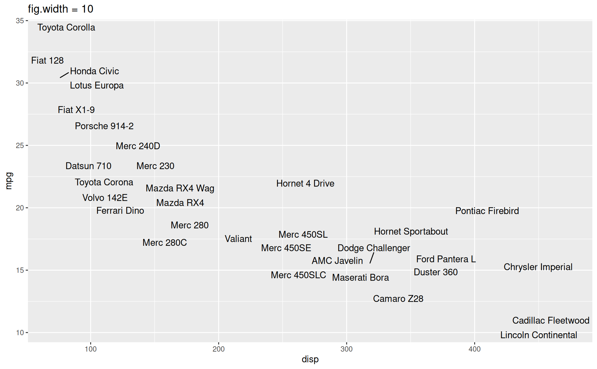
Small fig-width
For a zoomed-in look
```{r}
#| fig-width: 3
#| fig-asp: 0.618

p_hist
```
Large fig-width
For a zoomed-out look
```{r}
#| fig-width: 6
#| fig-asp: 0.618

p_hist
```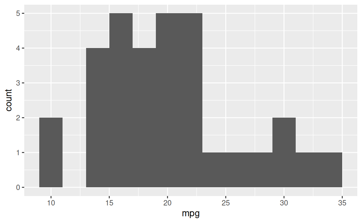
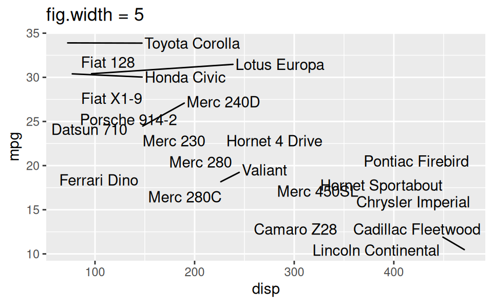
fig-width affects text size
Multiple plots on a slide
If no, then don’t! Move the second plot to to the next slide!
If yes, use columns and sequential reveal.
Quarto
Writing your project report with Quarto
Figure sizing:
fig-width,fig-height, etc. in code chunks.Figure layout:
layout-ncolfor placing multiple figures in a chunk.Further control over figure layout with the patchwork package.
Chunk options around what makes it in your final report:
message,echo, etc.Cross referencing figures and tables.
Adding footnotes and citations.
Cross referencing figures
As seen in Figure 1, there is a positive and relatively strong relationship between body mass and flipper length of penguins.
ggplot(penguins, aes(x = flipper_length_mm, y = body_mass_g)) +
  geom_point()
Warning: Removed 2 rows containing missing values or values outside the scale
range (`geom_point()`).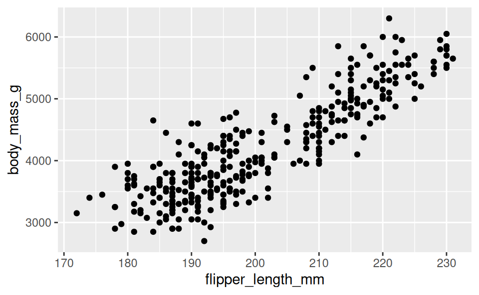
As seen in @fig-penguins, there is a positive and relatively strong relationship between body mass and flipper length of penguins.

```{r}
#| label: fig-penguins

ggplot(penguins, aes(x = flipper_length_mm, y = body_mass_g)) +
  geom_point()
```
Cross referencing tables
Table 1 displays summaries of flipper length by species.
penguins |>
  group_by(species) |>
  summarize(
    Mean = mean(flipper_length_mm, na.rm = TRUE),
    Median = median(flipper_length_mm, na.rm = TRUE),
    SD = sd(flipper_length_mm, na.rm = TRUE)
  ) |>
knitr::kable(digits = 3)| species | Mean | Median | SD |
|---|---|---|---|
| Adelie | 189.954 | 190 | 6.539 |
| Chinstrap | 195.824 | 196 | 7.132 |
| Gentoo | 217.187 | 216 | 6.485 |
@tbl-penguins displays summaries of flipper length by species.

```{r}
#| label: tbl-penguins
#| tbl-cap: Flipper length summaries by species

penguins |>
  group_by(species) |>
  summarize(
    Mean = mean(flipper_length_mm, na.rm = TRUE),
    Median = median(flipper_length_mm, na.rm = TRUE),
    SD = sd(flipper_length_mm, na.rm = TRUE)
  ) |>
  knitr::kable(digits = 3)
```
Take A Sad Plot & Make It Better
Going the extra mile
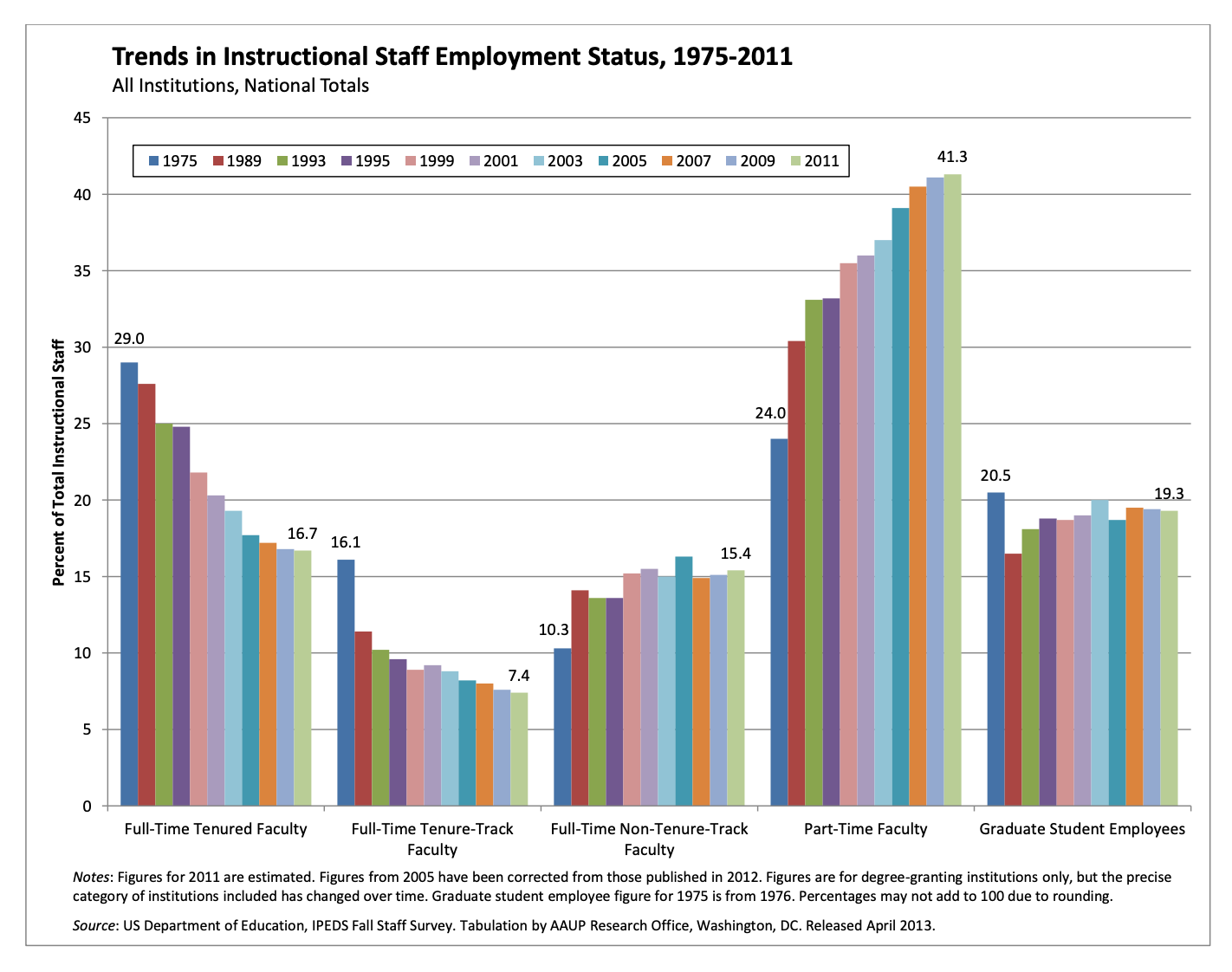
Trends in instructional staff employees at universities
The American Association of University Professors (AAUP) is a nonprofit membership association of faculty and other academic professionals. This report by the AAUP shows trends in instructional staff employees between 1975 and 2011, and contains the following image. What trends are apparent in this visualization?
ae-10-effective-dataviz
Data prep
Code
library(tidyverse)
library(scales)

staff <- read_csv("data/instructional-staff.csv")

staff_long <- staff |>
  pivot_longer(
    cols = -faculty_type, names_to = "year",
    values_to = "percentage"
  ) |>
  mutate(
    percentage = as.numeric(percentage),
    faculty_type = fct_relevel(
      faculty_type,
      "Full-Time Tenured Faculty",
      "Full-Time Tenure-Track Faculty",
      "Full-Time Non-Tenure-Track Faculty",
      "Part-Time Faculty",
      "Graduate Student Employees"
    ),
    year = as.numeric(year),
    faculty_type_color = if_else(faculty_type == "Part-Time Faculty", "firebrick1", "gray40")
  )
Pick a purpose
Code
p <- ggplot(
  staff_long,
  aes(
    x = year,
    y = percentage,
    color = faculty_type_color, group = faculty_type
    )
  ) +
  geom_line(linewidth = 1, show.legend = FALSE) +
  labs(
    x = NULL,
    y = "Percent of Total Instructional Staff",
    color = NULL,
    title = "Trends in Instructional Staff Employment Status, 1975-2011",
    subtitle = "All Institutions, National Totals",
    caption = "Source: US Department of Education, IPEDS Fall Staff Survey"
  ) +
  scale_y_continuous(labels = label_percent(accuracy = 1, scale = 1)) +
  scale_color_identity() +
  theme(
    plot.caption = element_text(size = 8, hjust = 0),
    plot.margin = margin(0.1, 0.6, 0.1, 0.1, unit = "in")
  ) +
  coord_cartesian(clip = "off") +
  annotate(
    geom = "text",
    x = 2012, y = 41, label = "Part-Time\nFaculty",
    color = "firebrick1", hjust = "left", size = 5
  ) +
  annotate(
    geom = "text",
    x = 2012, y = 13.5, label = "Other\nFaculty",
    color = "gray40", hjust = "left", size = 5
  ) +
  annotate(
    geom = "segment",
    x = 2011.5, xend = 2011.5,
    y = 7, yend = 20,
    color = "gray40", linetype = "dotted"
  )

p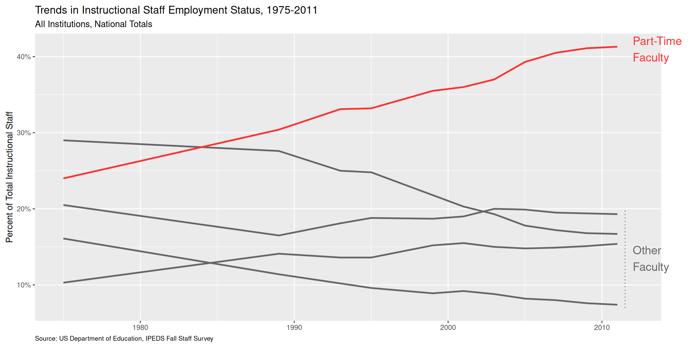
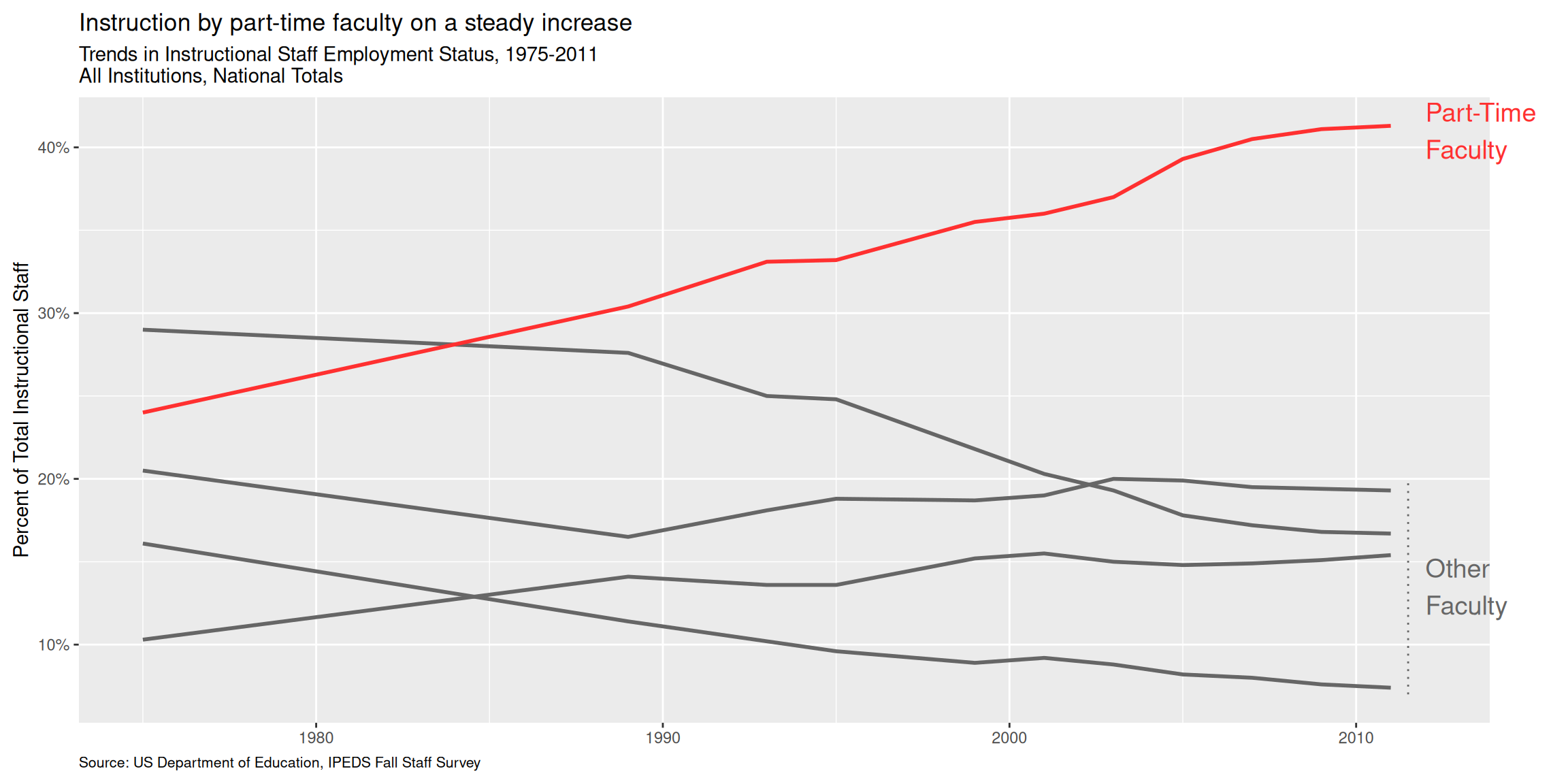
Use labels to communicate the message
Code
p +
  labs(
    title = "Instruction by part-time faculty on a steady increase",
    subtitle = "Trends in Instructional Staff Employment Status, 1975-2011\nAll Institutions, National Totals",
    caption = "Source: US Department of Education, IPEDS Fall Staff Survey",
    y = "Percent of Total Instructional Staff",
    x = NULL
  )
Simplify
Code
p +
  labs(
    title = "Instruction by part-time faculty on a steady increase",
    subtitle = "Trends in Instructional Staff Employment Status, 1975-2011\nAll Institutions, National Totals",
    caption = "Source: US Department of Education, IPEDS Fall Staff Survey",
    y = "Percent of Total Instructional Staff",
    x = NULL
  ) +
  theme(panel.grid.minor = element_blank())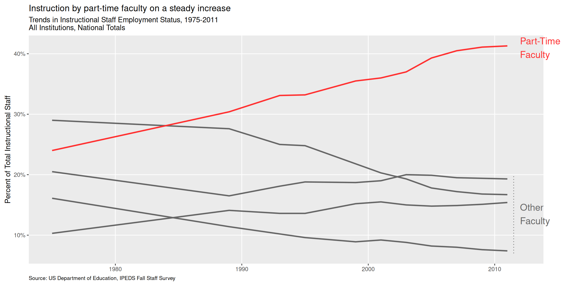
Summary
- Represent percentages as parts of a whole
- Place variables representing time on the x-axis when possible
- Pay attention to data types; e.g., represent time as time on a continuous scale, not years as levels of a categorical variable
- Prefer direct labeling over legends
- Use accessible colors
- Use color to draw attention
- Pick a purpose and label, color, annotate for that purpose
- Communicate your main message directly in the plot labels
- Simplify before you call it done (a.k.a. “Before you leave the house, look in the mirror and take one thing off”)